
Video
Tutorials
21 video tutorials covering everything from first launch to advanced responsive techniques. Watch, learn, and build — at your own pace.
Getting Started
2-
 Getting Started
CSS Frameworks
Design with the top CSS Frameworks on the market without coding. Site Designer provides a visual layer to these frameworks so that you may build your sites faster than ever before. Craft sites mobile-first or desktop down… we got you covered!
-
 Getting Started
Working with Templates
Browse the library of premade templates. Customize, mix them, gain inspiration, or use it as a jumping off point. We'll show you how to import and edit them so that you can kick off your next website masterpiece.
Canvas & Editing
5-
 Canvas & Editing
Content Elements
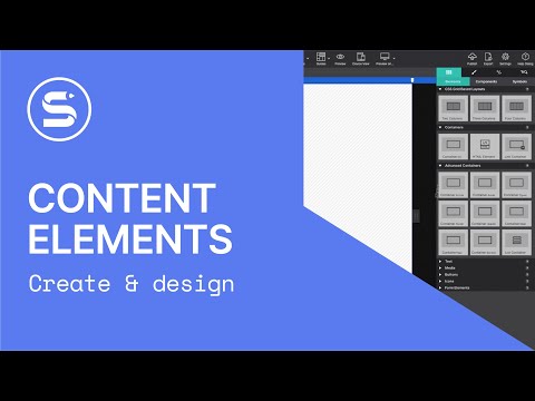
Learn about the page elements used to craft your website that you can find on the Content pane. You can always highlight the elements to create a great and interesting web design.
-
 Canvas & Editing
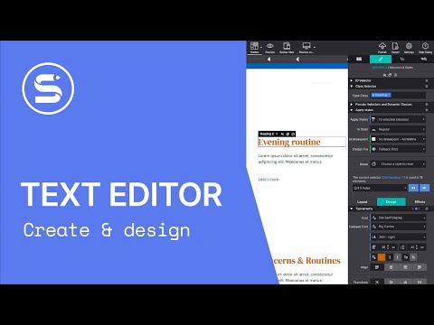
Text Editor
Watch how to pick the perfect styles for your text. Type right on the canvas, adjust global properties, or edit specific words inline. We have a great font library waiting for you.
-
 Canvas & Editing
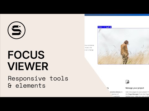
Focus Viewer
Select nested elements using the drop-down context menu and interact between elements faster than ever. You'll also gain access to common actions such as duplicate, delete, and edit text.
-
 Canvas & Editing
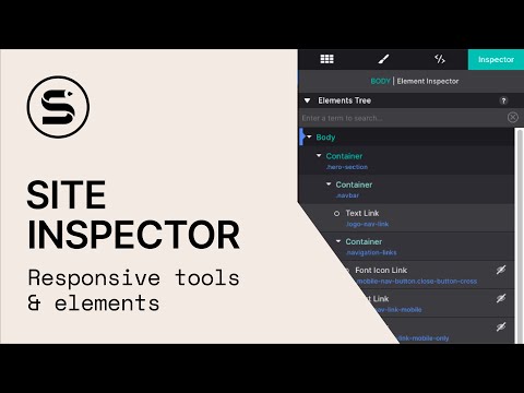
Site Inspector
Discover Site Designer's Inspector Pane. View a DOM tree of all page elements, search to find specific elements for styling, and access the CSS markup for all breakpoints. Moving elements around your page was never as easy.
-
 Canvas & Editing
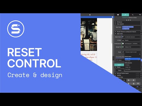
Reset Controls
Site Designer makes it a breeze to experiment with different options. However, if you don't choose to keep the tested styles, they will still be associated with your project and the CSS that is exported. The Reset control solves this problem.
Responsive Design
5-
 Responsive Design
Magic Slider
The Width Slider can be used to view the website at any possible width and help you decide if any such change will improve the user experience of the design. A friendly tool that you should always keep in mind.
-
 Responsive Design
Custom Breakpoints
Breakpoints are the secret weapon of responsive web design. They are the places where layout or style changes are being made. These allow you to ensure your content is always readable and usable no matter the user's screen size or device.
-
 Responsive Design
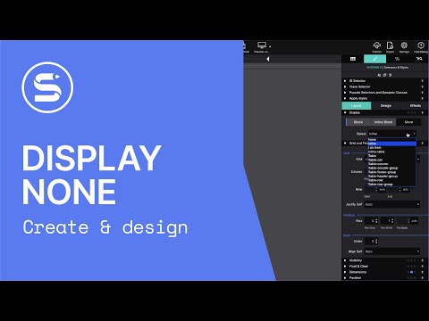
Display None
With Site Designer there are several ways to position content. But sometimes, your design might call for an item to be hidden. For example, hiding the mobile menu when the viewer is using a wide screen monitor. You could also hide unnecessary content for mobile viewers to give them a cleaner interface.
-
 Responsive Design
Responsive Images
The Picture element isn't just for displaying a photo on a page. It also unlocks the ability to deliver better fitting versions based on screen size. Today, the web is devoured from mobile devices in increasingly high numbers. By using the Picture element, you can rescue these viewers from downloading heavy, slow-loading image files.
-
 Responsive Design
Workflow Changes
Breakpoints are the secret sauce to developing a responsive website. They are the places where layout or style changes are being made. With Site Designer these special triggers may be added in just a single click. Watch this tutorial demonstrating how you would use the Breakpoints Bar and manage the breakpoints for your design.
Components
4-
 Components
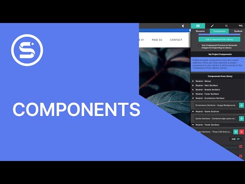
Components
Discover the power of customizable web components. Components usually consist of a group of several elements. Together they perform a more complex role such as a navigation menu, a photo gallery, a series of cards, an accordion, or tabs. Import and customize in seconds. Save and reuse throughout your projects.
-
 Components
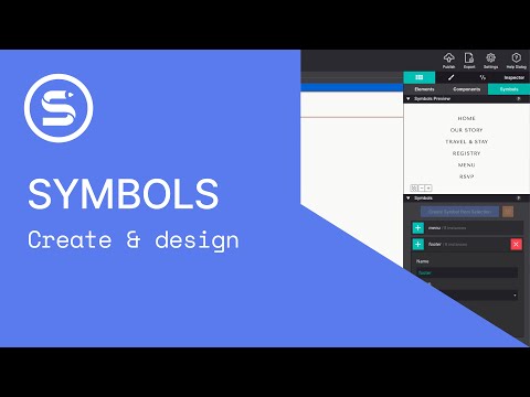
Symbols
Learn how to keep common features such as a navigation menu in sync across your project using Symbols. Edit once and your changes will update across all instances automatically.
-
 Components
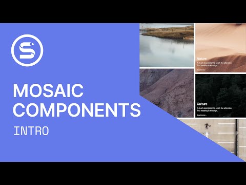
Mosaic Components
Discover a new way to layout content using the Mosaic Component Collection. Constructed using CSS Grid, these pre-built, customizable page sections feature fun hover effects, video backgrounds, and responsive actions.
-
 Components
Export Pages
The Components Library is one of the most powerful and useful features within Site Designer. It gives you the power to save content and reuse it within other website projects. You can even save entire pages and reuse them over and over again.
Design & Effects
4-
 Design & Effects
Effects
Animations that are triggered when the user scrolls or once the page loads are extraordinarily popular these days. They bring life to any design while directing the viewer's attention to special or important content.
-
 Design & Effects
Video Background
Understand how to work with the Background Video Element and Full Screen Background Video Element to create immersive, cinematic sections on your pages.
-
 Design & Effects
Display Rules: Blocks
The Display property plays an important role when it comes to the placement of elements. The two most commonly used controls are Block and Inline Block. In this video tutorial we'll explain the difference between these Display controls and demonstrate how they would be used.
-
 Design & Effects
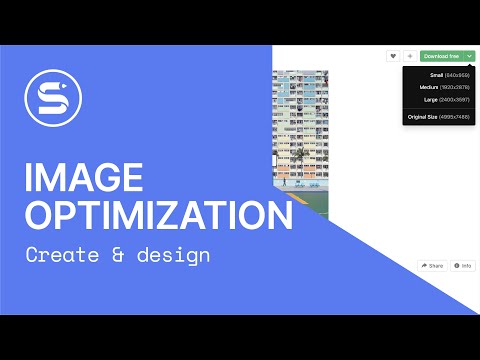
Image Optimization
It is good practice to design for performance and use images that are lightweight. This is especially true when your site uses many images as you want the load time to be as speedy as possible.