
Design changes at a breakpoint
Layout changes is what responsive design is best known for. They create room where needed, or fill in gaps when enough room is available. Frequently minor changes to the font size of headings is made to prevent them from wrapping at smaller widths. Such a wrap can have a big impact on the overall layout but this is easy to remedy in the app. Simply add a breakpoint just before the wrap happens and the layout breaks, then adjust the font size. Now continue to slide and you will see that with that change the layout will continue to look good a long way.
An almost endless number of responsive actions may be specified, ranging from minor adjustments to image sizes, margins, and font sizes, to major layout changes. These major layout modifications are what Responsive Web Design is best known for. Responsive actions like shifting, stacking, and swapping of page elements is what make a site truly device agnostic.
The viewport width slider
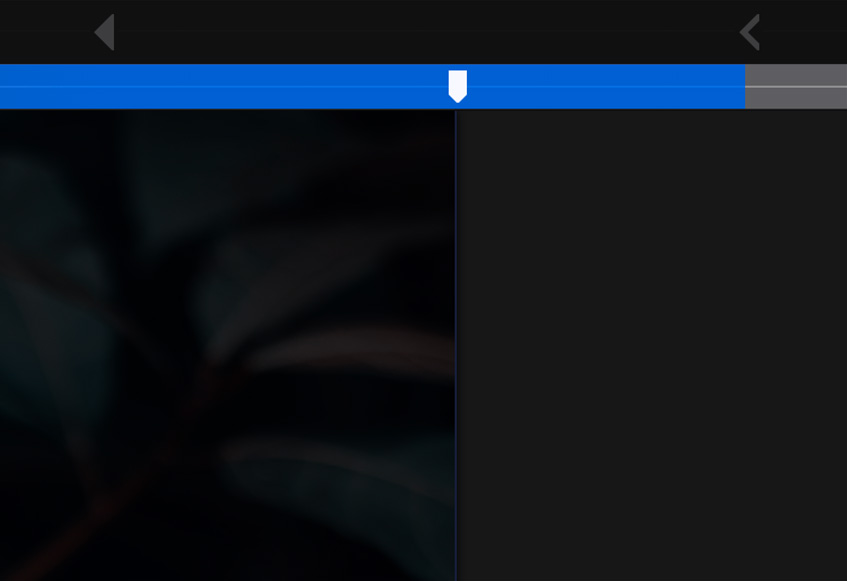
The width slider can be used to view the design at any possible viewport width and is instrumental for creating websites that look good on any screen and device.
Edit design
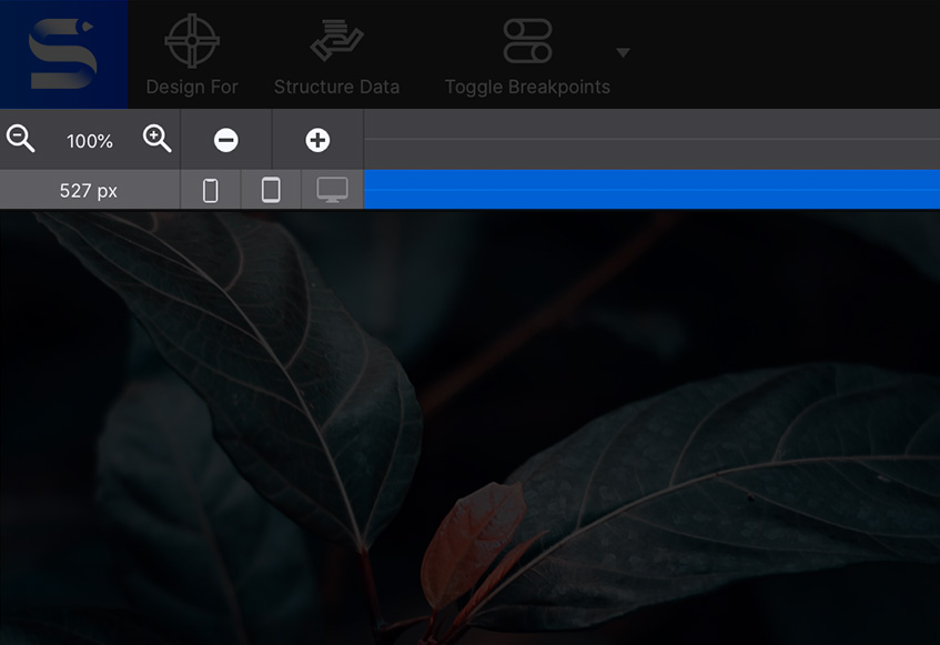
Tweak the design. Little indicators give you an idea of what size device your design would be seen on. Change layout structure, size of text, make buttons bigger or smaller, anything!
Breakpoints
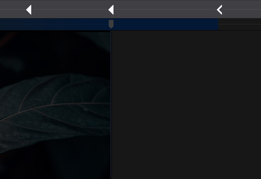
Add additional breakpoints if needed. If your framework doesn’t include all the layout sizes you require, use the +/- to manage extra breakpoints.