
Flexbox visual guide
Flexbox is a one-dimensional layout system — it works along a single axis at a time, either a row or a column. It excels at distributing space among items and aligning them, making it the go-to tool for navigation bars, card rows, and centering anything.
Enabling Flexbox
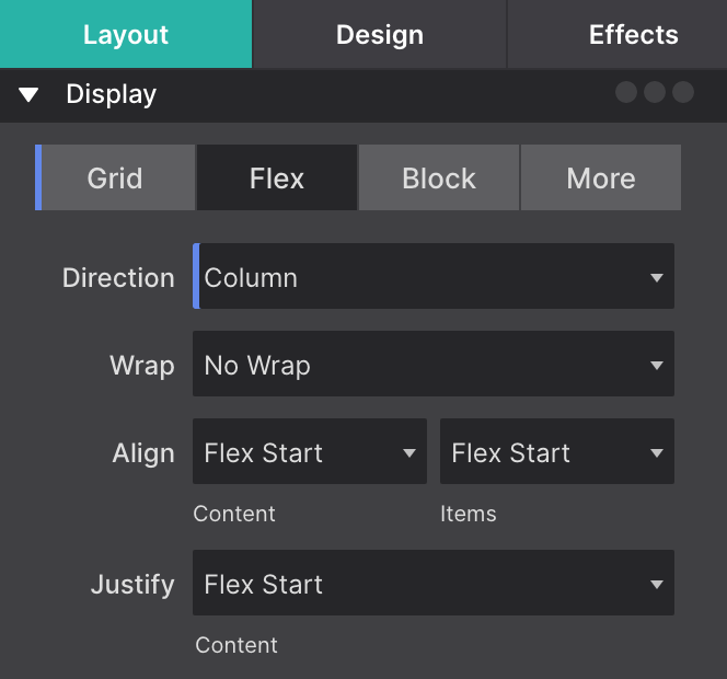
Select a container element and set display: flex in the Style pane. That container becomes the flex container, and its direct children become flex items. Child elements of those items are unaffected.
Flex container controls
These properties go on the container element.
flex-direction
Defines the main axis — the direction items are laid out.
row(default) — left to rightrow-reverse— right to leftcolumn— top to bottomcolumn-reverse— bottom to top
flex-wrap
nowrap(default) — all items stay on one line, shrinking to fitwrap— items wrap onto new lines when they overflow
justify-content
Distributes items along the main axis (the direction set by flex-direction).
| Value | Behavior |
|---|---|
flex-start | Items packed at the start |
center | Items centered |
flex-end | Items packed at the end |
space-between | Equal space between items, none at edges |
space-around | Equal space around each item |
space-evenly | Equal space between items and edges |
align-items
Aligns items along the cross axis (perpendicular to flex-direction).
stretch(default) — items fill the container’s cross-axis sizeflex-start/flex-end— align to start or end of cross axiscenter— center on cross axisbaseline— align text baselines
gap
Sets space between items. Use gap rather than adding margins to individual items — it’s simpler and doesn’t add extra space at the edges.
Flex item controls

These properties go on the individual items inside the container.
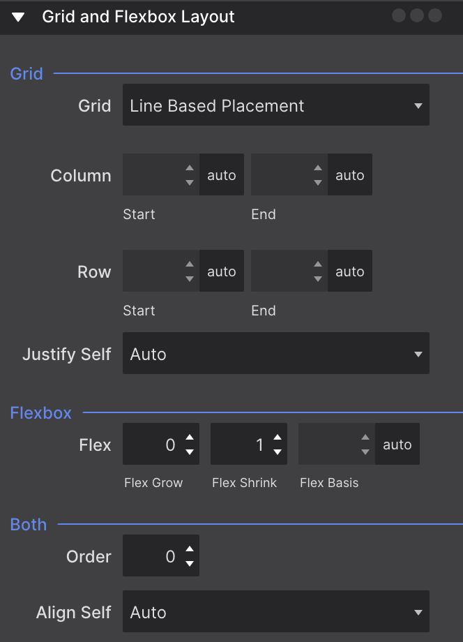
flex-grow — How much the item expands to fill extra space. 0 means it won’t grow; 1 means it takes an equal share of available space.
flex-shrink — How much the item shrinks when space is tight. Default 1. Set to 0 to prevent shrinking.
flex-basis — The item’s starting size before growing or shrinking. Often set as part of the shorthand.
flex shorthand — flex: 1 is equivalent to flex: 1 1 0% — grow, shrink, and start from zero. flex: 1 1 300px starts at 300 px and grows/shrinks from there.
align-self — Overrides the container’s align-items for one specific item.
order — Integer that controls visual position. Lower numbers appear first. Default is 0 for all items.
Practical patterns
Perfect centering
display: flex;
justify-content: center;
align-items: center;
Horizontal navigation bar
display: flex;
flex-direction: row;
gap: 1.5rem;
align-items: center;
Responsive card row that wraps
display: flex;
flex-wrap: wrap;
gap: 1.5rem;
Each card: flex: 1 1 300px — cards grow to fill the row but wrap when the row is narrower than 300 px per card.