
Workspace at a glance
The Site Designer workspace is organized into distinct zones. Understanding each one helps you work faster and find settings without hunting.
Meet the app interface
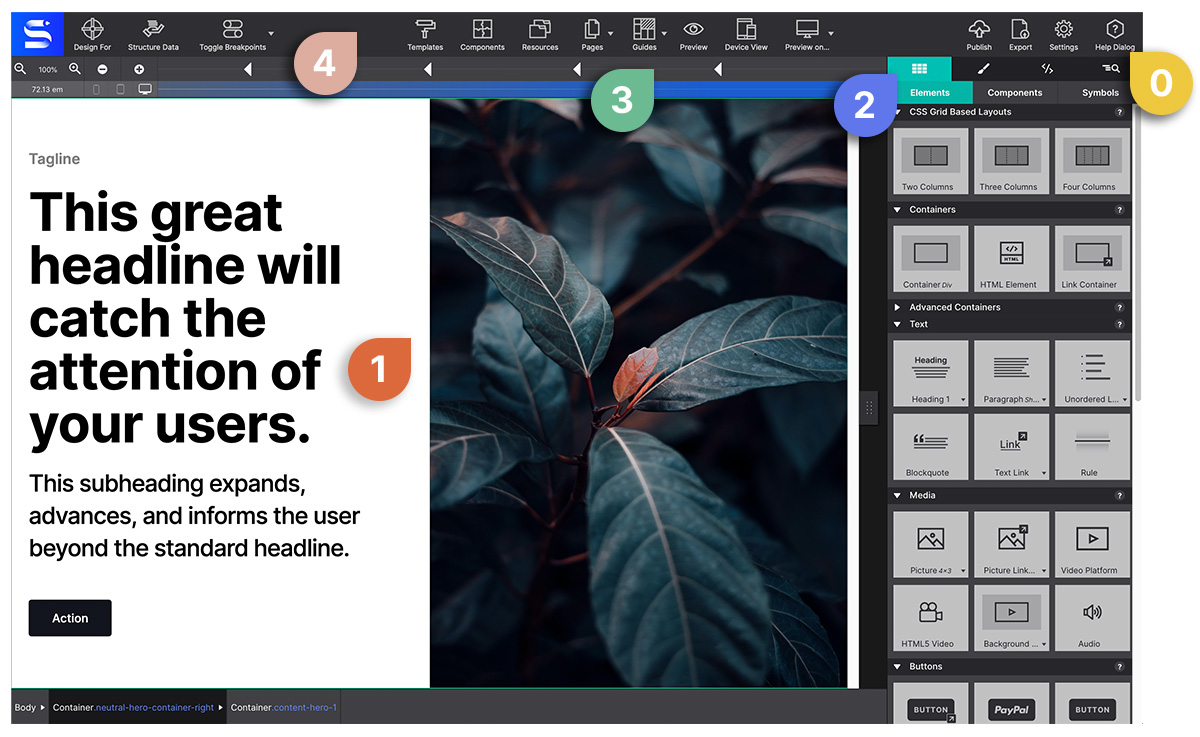
The numbers below match the ones printed on the screenshot above.
0 — Help
Help will always be given at CoffeeCup to those who ask for it. You can visit our forums to ask questions, or our five-star support team. Also the Help Dialog in the Site Designer toolbar is only one click away :)
1 — The real-time canvas
This is a browser-based working area. A major advantage of this is that what you are creating will look and feel the same as when the site is published on the web. The canvas is mainly used for the live design view, selecting or reordering elements, and editing texts.
2 — The control panes
On the right side of the app there are control panes, each with specific roles for visually managing the content, layout, styles, HTML, CSS and JavaScript, and page properties.
3 — Viewport slider & breakpoint manager
Above the canvas working area, you will see a bar aka the Viewport Width Slider. This bar contains a number of tools for managing the design at all possible device widths.
The breakpoints (also known as media queries) indicate changes in layout or content styles for a certain screen size. They are noted with a triangle along the top of the Viewport Width Slider. When they are active — meaning that styles will be applied to that viewport width — these triangles will be filled with another dark triangle inside.
The ones that are framework-specific breakpoints are indicated by a color (blue, pink, and purple). The breakpoints you create will display as white. Add and delete custom breakpoints using the +/- at the left side of the width slider bar.
4 — The toolbar

Access commonly used functions such as the Page Manager to add and delete pages, manage project Resources such as images, browse the Components Library, launch a Preview in a specific browser, Toggle Breakpoints, even Publish.
Video tour of Site Designer
- Browse the collection of getting started video tutorials ➔
- Step by step design tutorial for the Visions template ➔
Each zone in detail
Top toolbar
The horizontal bar across the top of the window. Contains:
- Page Manager (leftmost icon) — Add, rename, reorder, and delete pages in your project. The Page Manager dialog is also where you find Supports Query (feature queries for progressive enhancement) and Structured Data (JSON-LD Schema.org tags).
- Resources — Upload and manage images, fonts, and files.
- Templates — Browse and apply page templates.
- Components — Insert pre-built component blocks from Foundation, Bootstrap, Materialize, or your saved components.
- Live Preview — Opens the project through a web server already running on your own machine, so PHP and other server-side pages execute.
- Preview in Browser — Quick-open the current page in your default browser.
- Undo / Redo — Standard undo/redo with keyboard shortcuts ⌘Z / ⌘⇧Z .
- Settings — Export, publish, and project metadata.
The canvas (center)
The large central area where you design. It renders in a real browser engine, so what you see in the canvas is what visitors will see in their browser.
Key canvas behaviors:
- Click an element to select it — a blue border appears.
- Double-click a text element to edit it inline.
- Right-click anywhere to open the context menu.
- The breadcrumb bar at the bottom of the canvas shows the current selection path.
Width slider (bottom of canvas)
The horizontal slider below the canvas controls the preview viewport width. Drag left to simulate narrow screens; drag right for wide. Dashed vertical lines mark your breakpoints.
- Current width in pixels is shown on the right side of the slider.
- Click a breakpoint line to jump directly to that width.
- Enter breakpoint mode with the toggle button to edit styles at that specific width.
Control panes (right panel)
The right-side panel has five tabs, each giving access to a different set of controls for the selected element:
| Tab | Icon | What’s inside |
|---|---|---|
| Content | Text icon | Edit text, links, src, alt, custom attributes |
| Design | Brush icon | Classes/IDs (Element sub-tab) + all CSS visual controls (Style sub-tab) |
| Effects | Sparkle icon | Transitions, hover effects, animations, filters |
| Outline | Tree icon | Full DOM tree of the page; drag to restructure |
| CSS | Code icon | Computed CSS for the selected element (read-only) |
Status bar (bottom)
A thin bar at the very bottom of the window showing:
- Current file path
- Auto-save status
- Active framework (Foundation / Bootstrap / Materialize / None)
Collapsing and resizing panels
- Drag the border between the canvas and control panes to resize the pane width.
- Collapse the right panel by clicking the collapse arrow at its top-left corner.
Display preferences
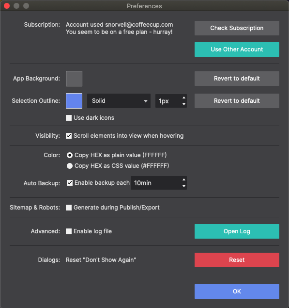
Under Settings → Preferences you can change:
- Canvas zoom level
- Grid overlay visibility
- Element highlight color
- Default element display mode
Additional options include selecting your element visibility — whether elements come into view when hovering over them — and your preferred color code type. Finally, you can let Site Designer build Sitemap and Robots files based on your entire project. A sitemap is a blueprint of your website that helps search engines find and index your pages.