
CSS Grid controls
The Grid Editor dialog is where you configure a CSS Grid visually. This article walks its controls in the order you meet them.
Grid Settings
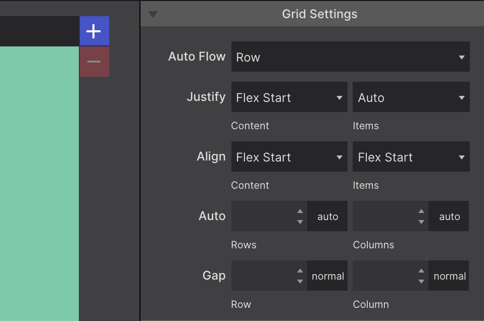
The main Grid Settings live at the top of the Grid Editor dialog.
- Auto Flow — how items are placed into the grid. By default grid items fill the cells row by row. The dropdown can change that to fill by columns, or to the more advanced
dense,row denseandcolumn dense. - Justify and Align — these work much like Flexbox’s align items. They determine where items sit within a grid area, along the column (block) and row (inline) axis.
- Auto — rows and columns created automatically normally grow and shrink to fit the content they hold. These controls specify a default size for that situation.
- Gap — gutters, creating separation between the rows and columns of the grid.
Rows and columns
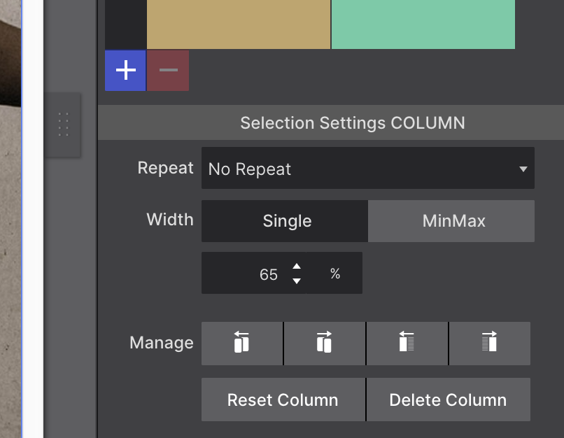
Build the layout using the respective + buttons for grid columns and rows — also known as grid tracks.
To configure a row or column, click on its header. The panel beneath the grid builder changes to show the appropriate Selection Settings.
Widths and heights default to Auto. Change them with the input and unit chooser, which includes the fr unit. A toggle switches between a Single value and MinMax values.
There are also Manage controls, which make it easy to duplicate rows and columns or move them into different positions.
Cell settings
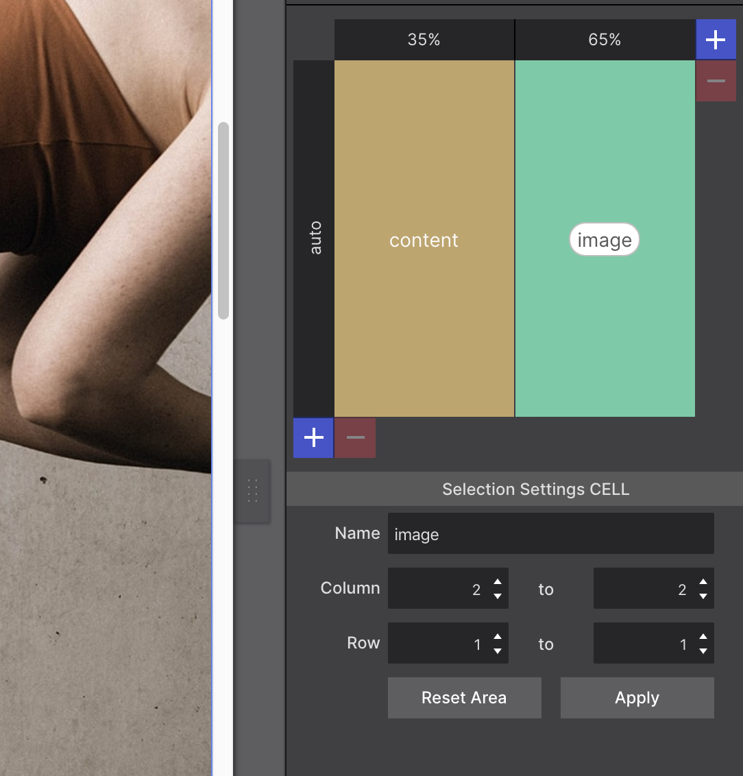
Cells in the grid can be given a name, entered directly in the cell or in the Name box in the control area.
When adjacent cells share the same name, grid areas are created. Grid areas can also be created with the Column and Row controls, specifying how far an area needs to stretch — which column and row it starts at, and where it ends.
Items are then placed by specifying which area they belong to. These grid areas can be changed at breakpoints.
Grid Area Based Placement
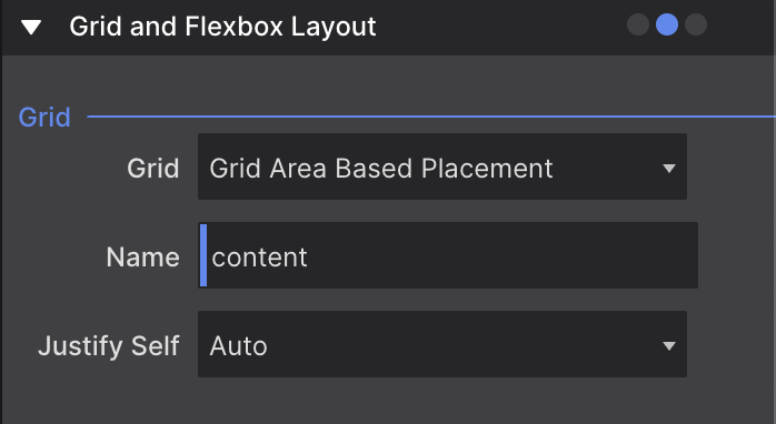
To place an item in an area, close the Grid Editor with the OK button at the top of the panel. Then go to Styles pane → Layout → Grid and Flexbox Layout, and in the Grid region use the Grid dropdown to select Grid Area Based Placement.
In the Name control, delete the placeholder elementArea and enter the name you assigned in the Grid Settings. Auto-suggest helps if you don’t remember the exact name.
Line Based Placement (advanced)
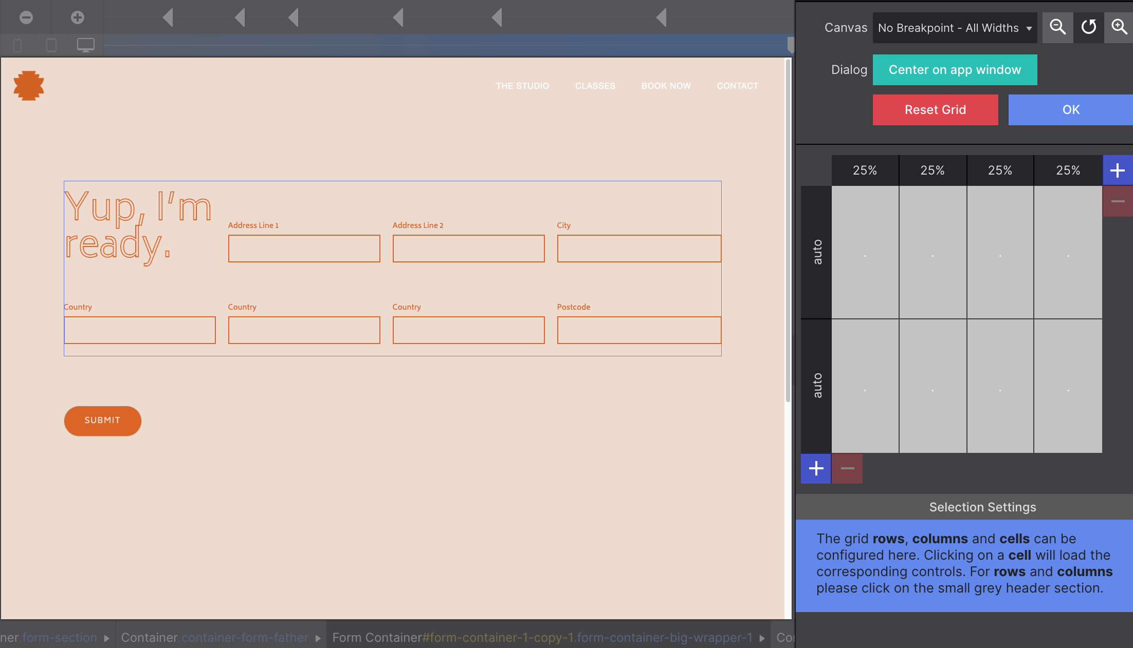
The other way to position elements is Line Based Placement, in the same place: Styles pane → Layout → Grid and Flexbox Layout → Grid region → Grid control.
It’s less intuitive than grid area names, but useful for quick adjustments and for making elements stretch without setting up area names first.
You can stretch an element through columns, rows, or both, in two ways.
Using “no unit” values
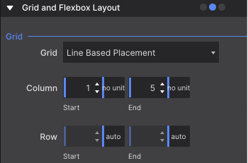
Say you have a four-column grid and a heading you want to stretch across all four. Select the heading, switch the Grid control to Line Based Placement, then set Column Start to 1 no unit and Column End to 5 no unit.
The end value is 5 rather than 4 because “end” means where the stretching stops. Using 4 would stop it just before the fourth column; to include the end of the fourth column you need 5 — before the fifth column, if one exists.
Using span
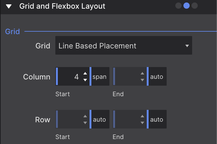
The same result is available with the span unit: set Column Start to 4 span, and the element spans the four existing columns.