
Canvas overview
In this chapter you will learn how to select and navigate through your elements. Not only that but also see how they will display on different widths for all the devices out there. Learn how to change page styles and layout for different screen sizes using the powerful Viewport Slider and Breakpoints Bar.
For selecting elements to style or position, you just need to click on them on the canvas. You will see a thin line around them showing you that it has been selected. Along the bottom bar you will see how the element selected changes and you can go to any of its parents by clicking on that node of the bar.
The Viewport Width Slider and Breakpoint controls are used for previewing and managing the page at different screen sizes.
The built-in width slider helps to test the layout, design and usability of the content at all possible screen widths. The page elements proportionally grow and shrink depending on the available space for displaying it. However, at some point layout or design changes are needed to prevent elements and content to become too small or otherwise unusable.
This is where the breakpoints come in. Anytime you feel a style or layout change is needed for a certain screen size, add a breakpoint, then customize the design as needed. The browser your viewer is using will see these breakpoints and will display the appropriate version of the design to the viewer.
A real browser engine, not a simulation
Most traditional design tools render a representation of your design — a pixel-accurate preview that approximates how a browser would display the content. Site Designer’s canvas is different: it renders your page inside an actual browser engine.
This means:
- Fonts, spacing, box models, and layout behavior all match exactly what your visitors will see.
- CSS features like
flexbox,grid, andclamp()work in the canvas because a real browser is processing them. - There is no “preview vs. reality” gap. What you see on the canvas is what gets published.
This approach is called live WYSIWYG (What You See Is What You Get). Changes to styles, content, and structure take effect immediately in the canvas without any render lag or refresh step.
Selected content stays in view
To check how a specific part of the design behaves at different screen widths, select any element in that section.
In a normal browser the content flows out of view as you resize. In Site Designer the selected content is auto-scrolled back into view instead — a small but extremely handy perk of the app.
Selection indicators
When you click an element, a blue border appears around it to indicate it is selected. This border is a canvas overlay — it does not exist in your actual HTML and will not appear on your published site.
When you hover over an element without clicking, a lighter blue highlight appears. This hover highlight helps you understand which element your cursor is over before you commit to selecting it, which is especially useful in dense layouts.
The breadcrumb selection path
At the bottom of the canvas, a breadcrumb bar shows the full nesting path of the currently selected element. For example:
body > .page-wrapper > section.hero > div.container > h1
Each segment in the breadcrumb is clickable. Click any ancestor to move the selection up to that element without having to click directly on it in the canvas. This is the fastest way to select a parent container that is obscured by its children.
Zoom controls
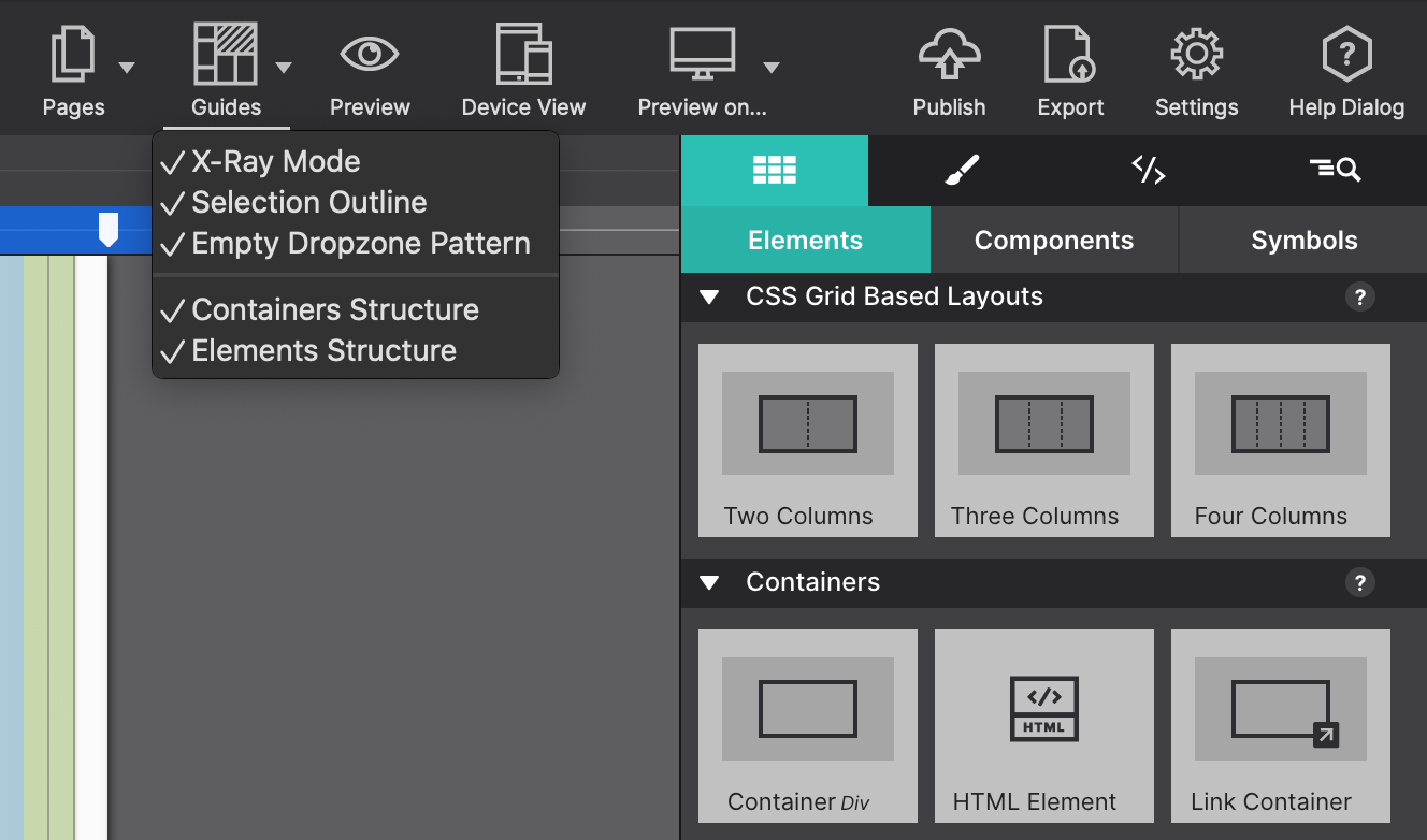
The canvas can be zoomed in or out to inspect fine details or see the full page at once.
| Action | Shortcut |
|---|---|
| Zoom in | ⌘+ |
| Zoom out | ⌘− |
| Reset to 100% | ⌘0 |
Zoom level is displayed in the bottom-right corner of the canvas. Zooming does not affect your actual design — it only changes how the canvas is displayed in the workspace.
Grid overlay
Site Designer can display a grid overlay on top of the canvas to help you align elements visually. Toggle it on or off from View → Show Grid. The grid does not add any CSS to your project — it is a canvas-only guide.
Grid settings (column count, gutter width, and color) are adjustable under Settings → Canvas → Grid.
What the canvas does not show
A few things are intentionally hidden from the canvas view to reduce clutter:
display: noneelements — hidden elements are not visible on the canvas. Select them through the Elements Tree instead.- Pseudo-elements (
::before,::after) — these are rendered but cannot be selected directly on the canvas. Edit them via the CSS pane. - Animations in their final state — animated elements always appear in their starting state on the canvas. Use Live Preview to see animations play.