
From static to responsive, step by step
A layout built in Site Designer starts off fluid, which means the first ingredient of a responsive design is already there: a grid-based layout that shrinks and grows with the display width. Every width calculation is handled for you, including the recalculations needed when columns stack on smaller screens or unstack on large ones.
This article walks the second ingredient: finding the widths where the design stops working, and fixing it there.
1 · Test what you have
Grab the slider handle above the preview area and drag it left.
The first thing to notice: all the columns get smaller, but font sizes stay the same. Where text runs out of horizontal room it wraps onto more lines, making the design taller. A callout heading that used two lines at full width takes three a little narrower:
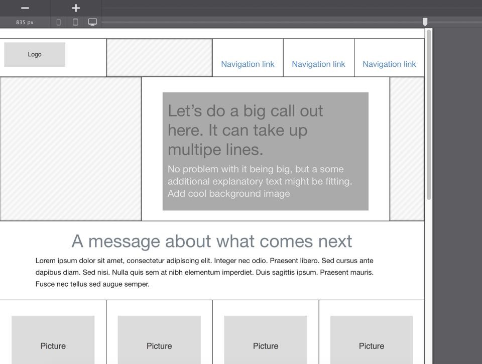
Images, by contrast, do scale down proportionally.
All of this works well for small changes in width. But at some point there is barely any room left for the text to wrap into, and the images render too small to read. That is the moment the second ingredient is needed.
2 · Add the first breakpoint
Move the slider to 800px — the arrow keys give you precision — then click the big plus button above the device indicators, to the left of the preview area. A point appears on the line above the slider handle.
From here on you can define new layout and design styles. Every style you defined earlier keeps applying until you overrule it at a breakpoint, and you work exactly as you did before — same controls, same panes, just at a narrower width.
A fixed-width design usually carries empty columns. Those are the easiest source of extra room: make them narrower here, and give the space to the columns that hold content.
In the worked example that meant:
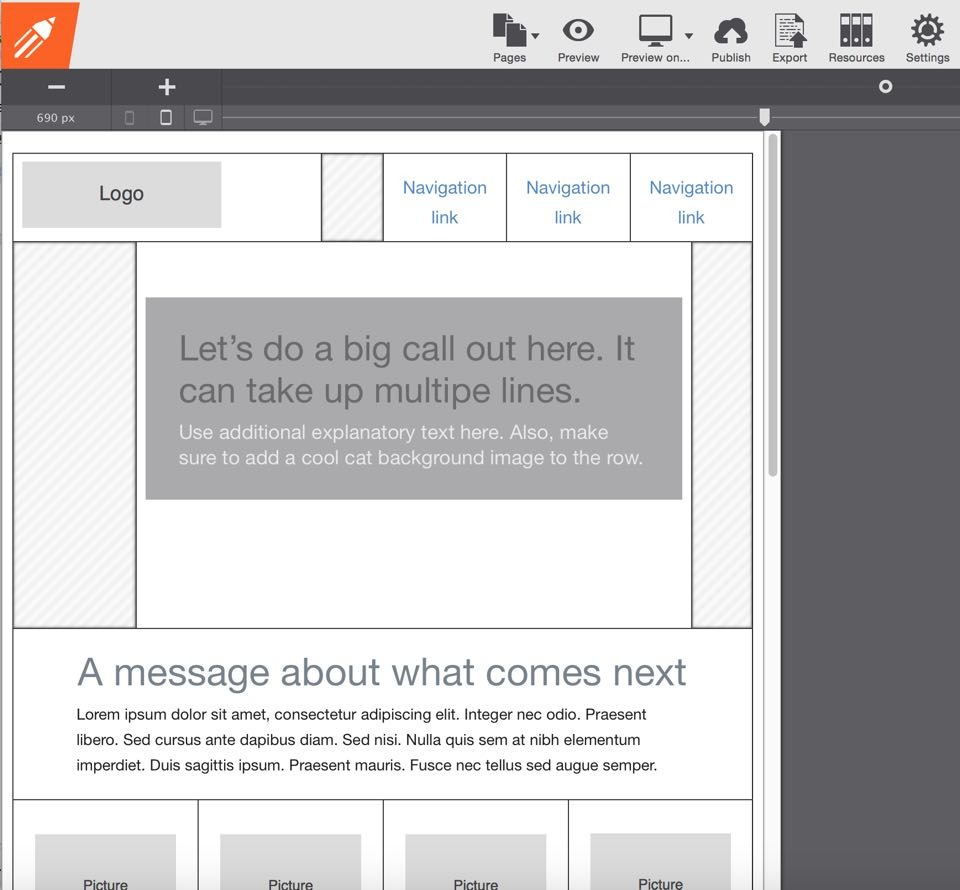
- The second column, next to the logo, goes from a span of 3 to 1
- The logo column goes to 5
- In the second row, the first column goes to 2
- The column holding the callout message goes to 9
That alone frees up real space, with the original design and layout intact.
Keep dragging left and the navigation text starts wrapping. Easy to fix: double-click any navigation link to open its styles and reduce the top padding to about 10px. Because all three links share a class, all three update at once.
3 · Keep going, add more breakpoints
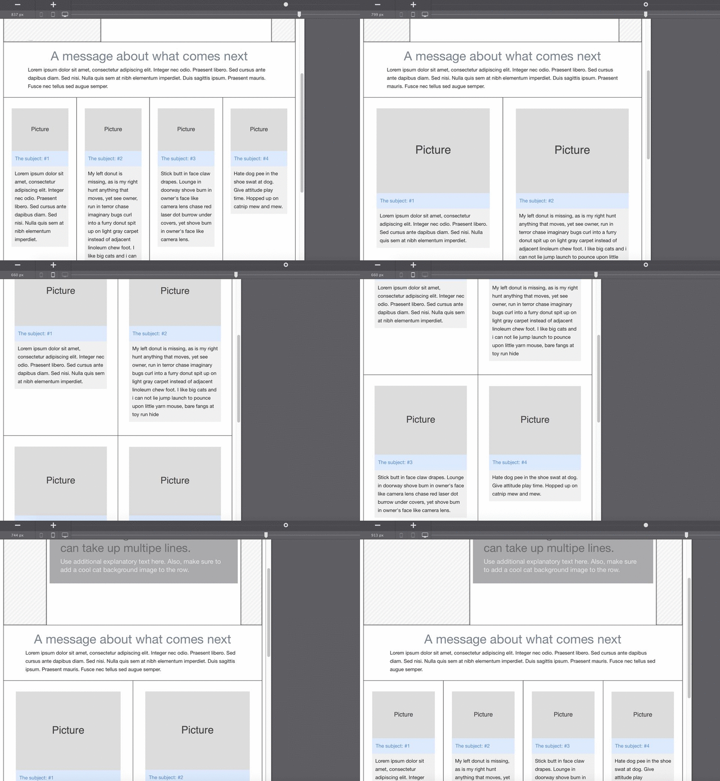
Continue left and the four picture columns become very narrow, very quickly, at around 650px. Two columns would suit that width better.
Add another breakpoint, select each column and change its span from 3 to 6. Drag the slider back and forth across the breakpoint to watch the change take effect.
One detail remains: the heading and paragraph are now wider than the picture above them, because the Picture element has a default max-width of 200px. Select the picture and set the max-width control to none.
4 · Make horizontal room on small screens
Below the second breakpoint, narrowing columns is no longer enough. Two techniques buy back the space.
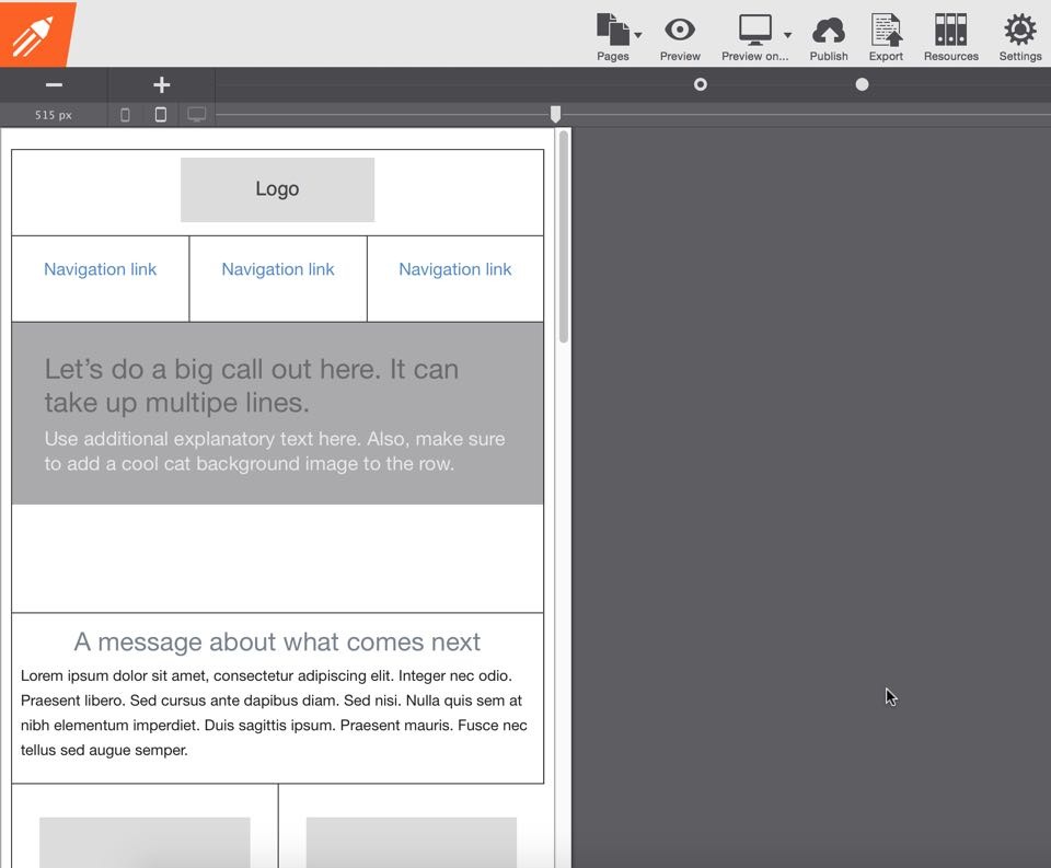
Hide what carries nothing. Select the empty column next to the logo, give it a meaningful class such as hide-col-2 — the name says what it does and at which breakpoint — then set Display to none in the Position section. The column disappears and leaves its space to the others.
Reuse that class anywhere else you need the same behaviour: select the next empty column, start typing hide-col-2 in the class box, and pick it from the autocomplete. The styles apply as soon as the box loses focus.
Stack what still doesn’t fit. If the logo and navigation are still cramped, set the logo column to a span of 12 and each navigation column to 4, so the logo sits on its own line with the links below. Centring the logo is one more step: double-click it and set the left and right margins to auto.
Apply the same treatment to the callout row — hide the empty columns with the class you already made, then set the callout container to 12 spans. Reducing its top margin to 0px tightens things further.
The part that matters
Breakpoint positions are arbitrary and yours to choose. The changes above could have started at 702px, or 677px, or anywhere else that looked right. Your job is to make the design good and the content usable at any width — not to hit particular numbers.
And content changes. A longer callout message may mean moving a breakpoint or adjusting a few settings. Designing for continued change is normal, and it is quick once the structure is in place.
Next steps
- Responsive design demystified — the concepts behind what you just did
- Custom breakpoints — managing breakpoints in detail
- Hide and show elements — the Display control per breakpoint