
Animate with states and transitions
Browse tutorials- What you'll build
- Hover and Out of View effects on your elements, driven by the In State dropdown rather than a keyframe editor.
- Time to complete
- 10–15 min estimated
- Prerequisites
-
- Know how to apply a class — see Working with classes.
- Read Using the State dropdown first if states are new to you.
A responsive page can still feel static. Motion in Site Designer doesn’t come from a timeline or a keyframe editor — there isn’t one. It comes from styling an element differently in different states, and letting a transition carry it smoothly between them.
The four transition controls
The Transitions section of the Styles pane gives you:
| Control | What it does |
|---|---|
| Apply To | Which properties the transition is associated with |
| Function | The acceleration curve, so speed can vary over the duration |
| Duration | How long the transition plays out |
| Delay | How long after the trigger before it starts |
Function is the CSS transition-timing-function. The available curves are Ease, Linear, Ease-Out, Ease-In and Ease-In-Out.
Worked example: an image that grows on hover
-
Move to a wide breakpoint first
Hover doesn’t exist on phones and tablets, so move the viewport slider to a breakpoint for larger monitors — around 900px or wider — before styling the hover state.
-
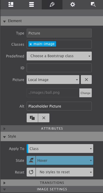
Style the hover state
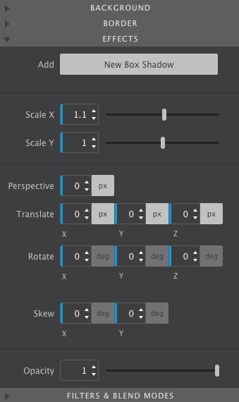
Double-click the picture to open its styles and switch the state to Hover. Scroll to the Effects section, which holds options for scaling on X or Y and rotating to an angle. For this example, set Scale X to
1.1.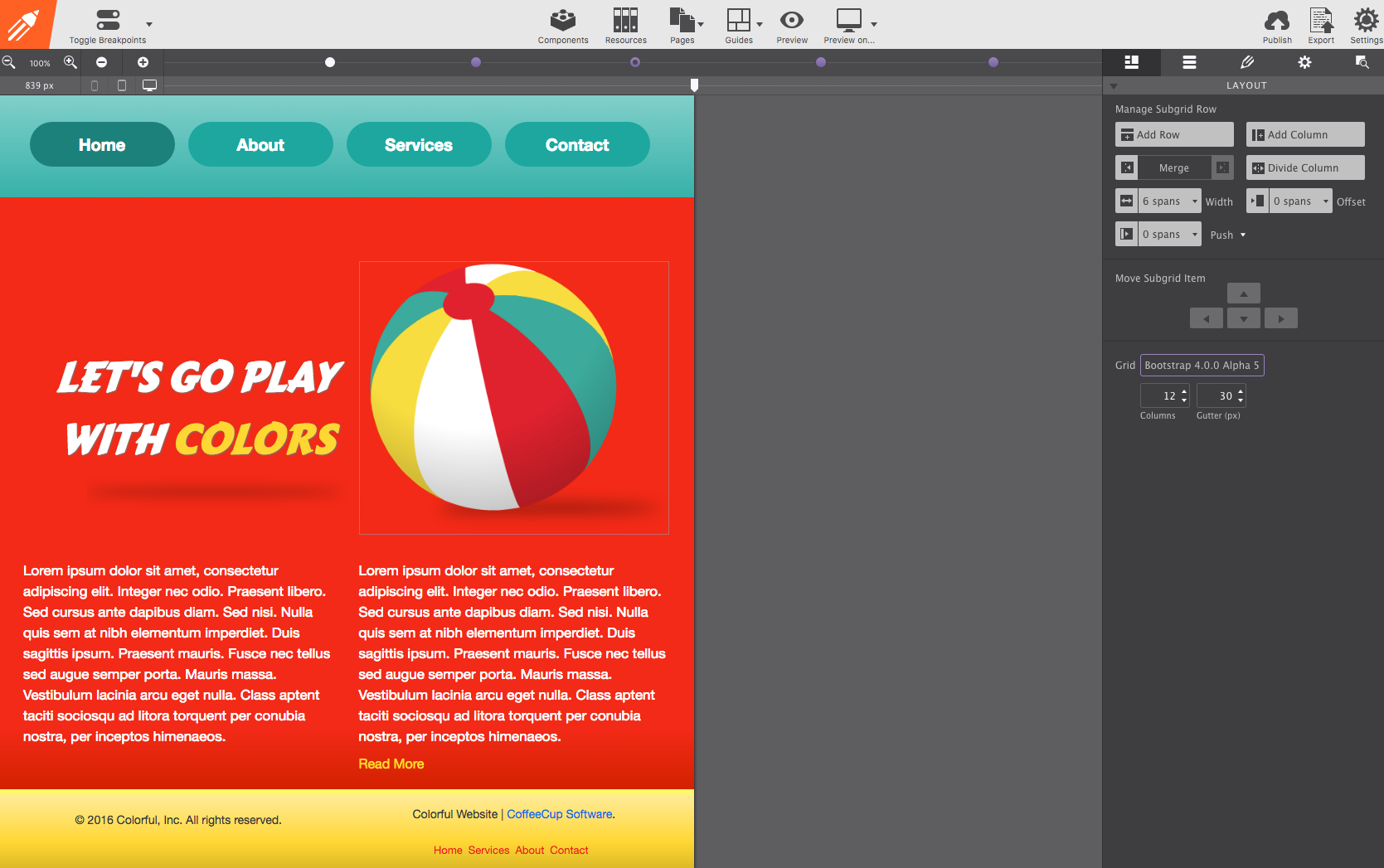
-
See the problem
Go into Preview and hover the image. It grows — but the jump from Regular to Hover is immediate and rough. That’s what the transition fixes.
-
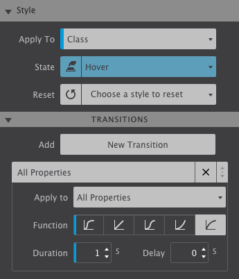
Configure the transition on Hover
Still in the Hover state, open the Transitions controls. There’s one transition in effect by default; click its tab to configure it. Use the function ease-out, a duration of 1 second, and no delay.
-
Configure the return trip too
A transition set on Hover only governs the way in. Switch the state back to Regular and set a transition there as well — ease-in-out, 1 second — so the image settles back just as smoothly.
Beyond hover: the Out of View state
Out of View is a state for an element that hasn’t been scrolled to yet. Style it there, and the element animates as it arrives on screen.
Three variations from the same idea:
- Zoom out — increase the XY scale in Out of View, transition 1 second, and the element settles down to its normal size as it enters.
- Fade and rise — shift the image down about 40px with Translate and lower the opacity, with a faster transition of 0.5 seconds.
- Pop in — lower both the XY scale and the opacity, again at 0.5 seconds, so the element pops up to full size.
Any of these can be combined with a rotation on hover — increase the Z variable, transition 1 second in and 0.5 seconds back.