
Common Elements: Container, Section, Divider, Button
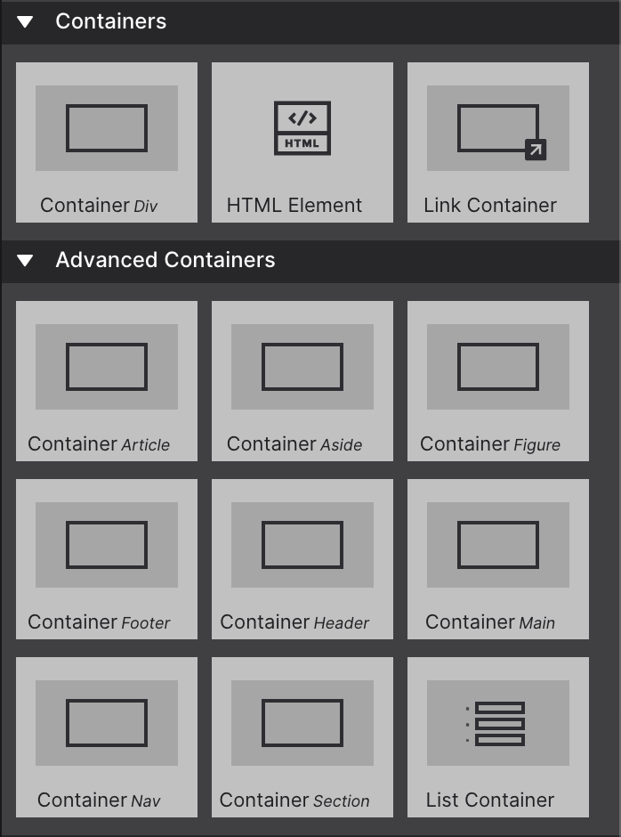
Four elements appear on virtually every page you build: Container, Section, Divider, and Button. This article explains what each one is, what HTML it produces, and how to choose between the similar-looking options.
Container
The Container element creates a <div> — the most versatile element in HTML. It is a block-level grouping element with no inherent semantic meaning. Its entire purpose is to hold other elements so you can position them together, apply shared styles, or create a layout context.
Containers often serve as “wrappers” for related elements — for example, a card component’s Container typically wraps a text element, an image, a button, and sometimes sub-containers with additional elements.
When to use a Container:
- Wrapping a group of elements that share a background color or border
- Creating a max-width wrapper to center content on wide screens (
max-width: 1200px; margin: auto) - Any structural grouping where no HTML5 semantic element applies
- As the direct child of a Grid or Flex layout to create grid cells or flex items
Container vs. Section (see below): if the group of elements constitutes a major, self-contained region of the page (hero, features, testimonials, contact), use Section. If it’s a layout grouping within a region, use Container.
Containers are infinitely nestable. You can place a Container inside a Section, a Grid cell inside that Container, and further Containers inside those grid cells. Site Designer enforces valid HTML nesting and warns you if you try to create an invalid structure.
A Link Container works exactly like a regular Container, but wrapped in an anchor — making the entire block one big clickable link.
Advanced Containers
While the plain Container (<div>) used to be the most common choice, Site Designer also offers nine semantic Advanced Container types for building more structured, meaningful pages: Nav, Header, Footer, Article, Aside, Main, and others. Using a semantic container tells search engines and assistive technology what that region of the page actually holds — a Container Nav for navigation, a Container Footer for the page footer, and so on.
List Containers are unordered lists where each list item is itself a container — commonly used to build navigation components.
The HTML Element
Adding custom HTML or embed code to your page is done through the HTML Element — a Container variant built to hold custom code snippets or exports from other apps, including CoffeeCup apps like Web Form Builder or third-party widgets. So it doesn’t interfere with the rest of the canvas, it displays as a placeholder visual until you preview or export the page.
Markup for the HTML element is entered on the Element pane → Selected Element Properties, inside the HTML box.
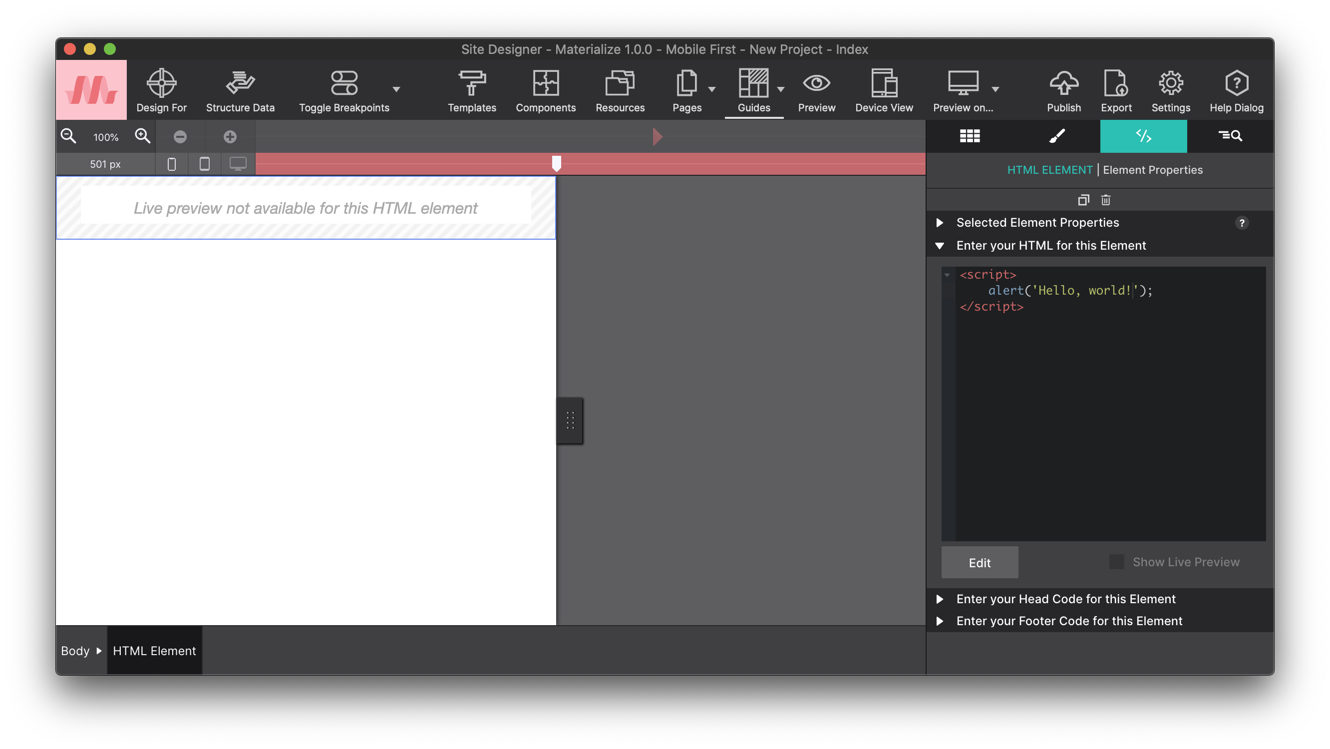
The built-in Code Editor dialog gives you a proper coding environment. Add an HTML Element to your page, then choose Edit in Dialog from the Element pane to launch it.
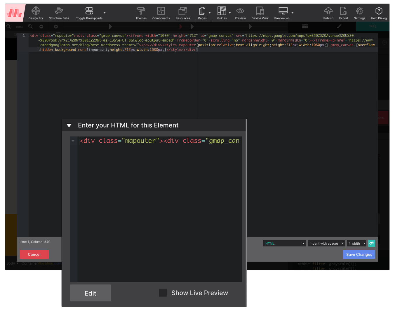
Step 1 — Drop the HTML Element. Place it where you want the custom code or object to appear. This works well for anything from menus and web forms to slideshows.
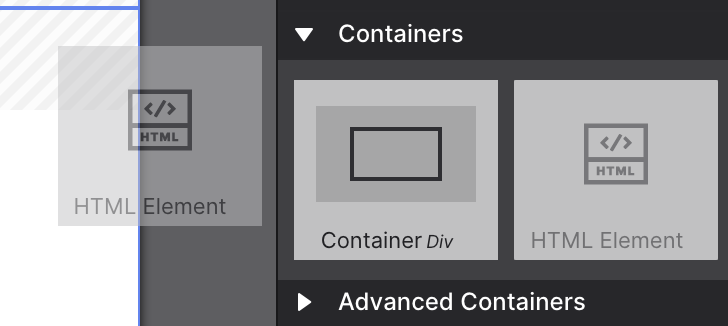
Step 2 — Add code, then tweak the design. Paste the code into the HTML box on the Element pane. It can be positioned and styled just like any other element — borders, backgrounds, spacing, and so on.
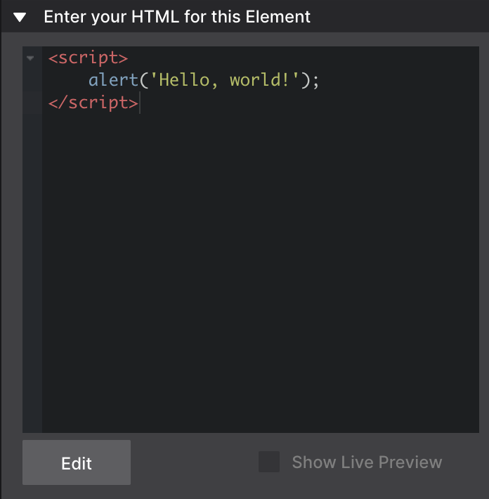
Step 3 — Connect additional resources if needed. Stylesheets and other resource files can be linked using the Head or Footer boxes on the Page Manager.
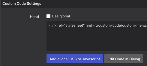
- Learn how to add a responsive Google Map using the HTML element ➔
- Working with custom scripts for adding special content to your web pages ➔
Section
The Section element creates an HTML5 <section> tag — a semantic landmark that represents a thematically distinct region of the page. Unlike a <div>, a <section> tells browsers, search engines, and assistive technology that the content inside it belongs to a coherent topic.
When to use Section:
- Major page regions: hero area, features section, testimonials block, contact section, footer region
- Any grouping that would have a heading (
<h2>or higher) introducing it - Regions a visitor might want to jump directly to
When not to use Section:
- Do not use
<section>purely for styling (that’s what<div>is for) - Do not use
<section>as a generic row wrapper inside a grid — use a Container - Do not nest Sections inside Sections unless the inner section truly is a sub-region of the outer one
Section vs. Container at a glance:
Section (<section>) | Container (<div>) | |
|---|---|---|
| Semantic meaning | Yes — thematic region | None |
| Appears in landmark list | Yes | No |
| Should have a heading | Ideally yes | Not required |
| Use inside grid cells | No | Yes |
| Use for page regions | Yes | Only as fallback |
Divider
The Divider element creates an HTML <hr> (horizontal rule) — a thematic break between sections of content. It renders as a horizontal line and is intended to signal a topic change, not just visual spacing.
Use a Divider between two content blocks that are related but distinctly different topics — for example, between a biographical section and a contact form section. For purely visual spacing between elements, use padding and margin on the surrounding containers instead.
Styling dividers: Select the Divider element and use the Style pane to change its color, height (border-width), width, and margin. A Divider can be styled as a thin hairline rule, a bold accent bar, or a decorative element with border-radius.
Button
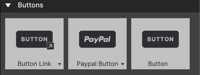
These elements generally perform an action in response to a visitor’s interaction. The Button Link is the most common one — when clicked, it can direct the reader to a new location, open a menu, reveal a hidden element, or show a modal dialog. The destination can be a location on the page, elsewhere on the site, or an entirely different site.
The Button element creates either a <button> tag or a styled <a> (anchor) tag, depending on its configured action.
Button types
| Type | HTML output | Use when |
|---|---|---|
| Button | <button type="button"> | Triggers JavaScript actions (open modal, toggle menu) |
| Submit | <button type="submit"> | Submits a form — must be inside a Form element |
| Link | <a href="..."> styled as a button | Navigates to a URL — acts as a link, not an action |
Button Link variations
- Button Link Image — shows a graphic instead of, or alongside, the button label.
- Button Link Icon — pulls in a font icon inside the button.
- Download Button — immediately downloads a file (PDF, image, etc.) already loaded into your project resources, instead of navigating to it.
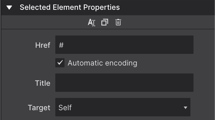
Configure the link destination for any Button Link on the Element pane → Selected Element Properties — see Working with Links for the full Href, Title, and Target reference.
The plain Button element (not a link) is used when wiring up external features such as a custom form, or in combination with custom JavaScript or framework capabilities.
Configuring a button
Select the Button element and open the Element pane:
- Label: The visible button text
- Type: Button, Submit, or Link (see above)
- URL (Link type only): The destination URL or internal page
- Target (Link type only):
_selfor_blank - Disabled: Grays out the button and sets
disabledattribute
Styling buttons with classes
Buttons are styled using CSS classes. By default, Site Designer applies a base .btn class. Add additional classes in the Styles pane to apply framework button variants (e.g., Bootstrap’s btn-primary btn-lg, Foundation’s button large) or your own custom classes.