
Project components
After adding a component to your project, you reach it from the Components sub-pane of the Content pane.
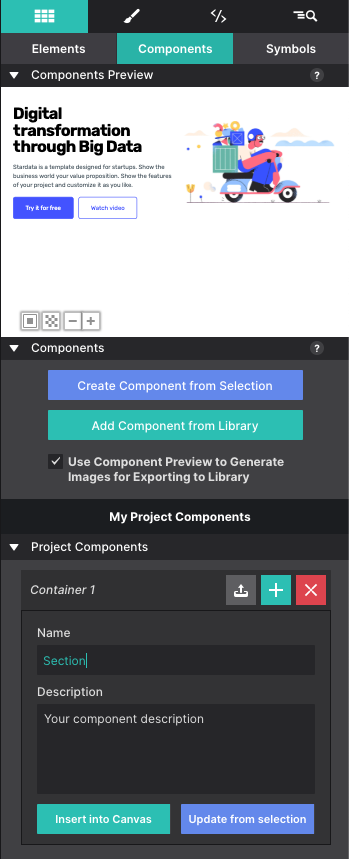
The preview window
The upper part of the pane previews the selected component.
- Background colour. A white component doesn’t show well on a white background, so the previewer’s background can be toggled. The bottom-left button cycles between white, black and transparent.
- Zoom. The plus and minus buttons next to the background button zoom in and out. When a project holds several similar components, that extra detail helps you find the right one.
The component list
The preview always shows the component currently selected in the list below it.
- Rename — click a component to expand it, and the name becomes editable.
- Insert — click the plus (+) button. The component is inserted below the currently selected element.
- Remove — use the delete (X) button next to the component’s title.