
Hide and show elements at breakpoints
Hiding an element at certain widths is one of the most useful responsive techniques there is — a decorative column that earns its place on desktop is often just clutter on a phone. Site Designer offers two controls that both hide things, and choosing the wrong one is a common source of confusion.
The difference in one line
- Visibility hides the element but keeps its space.
- Display: None hides the element and removes its space.
The Visibility control
The Visibility control hides an element without changing the layout of the document. The space the element occupies stays on the canvas — the element simply is not drawn.
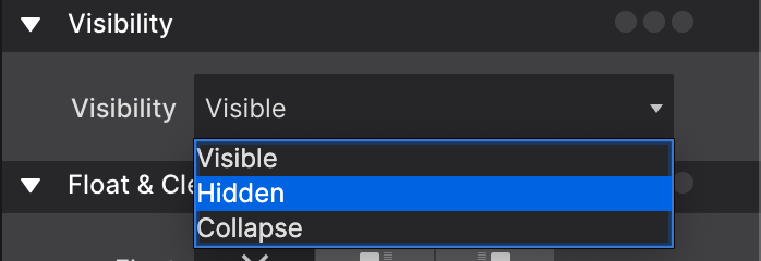
It takes three values:
| Value | Behaviour |
|---|---|
| Visible | The normal state of the element. |
| Hidden | Hides the element and keeps its space. |
| Collapse | Behaves as Hidden for most elements. On Flexbox items it also takes away their space. |
Hiding with Display: None
This is the control behind most responsive hide-and-show work. Set Display → More → None at the breakpoint where the element should disappear, and the space it held is redistributed to everything around it.
Because it is set per breakpoint, the same element can be visible on desktop and gone on mobile, with no duplicate content to maintain.
Getting hidden elements back
An element with display: none is invisible on the canvas too, which makes it awkward to select and restyle. There are two ways back to it:
- Tick Show hidden elements on the layout pane. Hidden items reappear so you can work on them.
- Select it from the Elements Tree, which lists every element on the page whether or not it renders. The eye icon beside a row shows whether that element is hidden at the current breakpoint and state — click it to override the styles hiding it.
That second route also covers elements that are hidden by design rather than by you: mobile menus that slide in, accordion panels, modal dialogs.
Which to use, in practice
Reach for Display: None when the element should not be there at all — an empty spacer column, a decorative image, a secondary navigation on small screens.
Reach for Visibility: Hidden in the rarer case where the space itself is doing work: keeping a grid aligned, holding a column open, preserving the rhythm of a row while one item is not shown.