
Responsive design demystified
Everyone knows how much web browsing happens on phones and tablets, and that responsive design is the only sensible answer to screens of every size. Yet responsive design still carries a certain mystique.
Some hesitation is understandable: we are all used to designing for fixed dimensions, and “dimensionless” design is a genuinely different idea. The good news is that there are only two ingredients behind a solid responsive design. Grasp the concept and the rest follows — especially with a tool that writes the code for you.
The two ingredients
A responsive design starts with a flexible, fluid layout. If a fixed website is a printed brochure, always the same size, a fluid layout grows and shrinks proportionally with the space available to display it.
That alone is a great start, but it is not enough. On a small phone screen, text becomes unreadable or only part of the site’s width fits. Things get squashed, links become hard to tap, and visitors have to pan and zoom to get anywhere.
Which is where the second ingredient comes in: media queries. A media query is a small piece of CSS that asks the visitor’s device how much space it has, and delivers style rules written for that width. Now the layout can do more than grow and shrink — it can shift, move and morph to fit the screen showing it.
Ingredient one: a fluid, grid-based layout
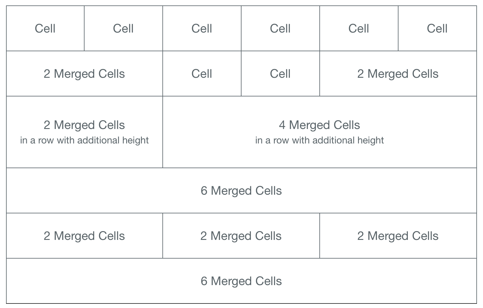
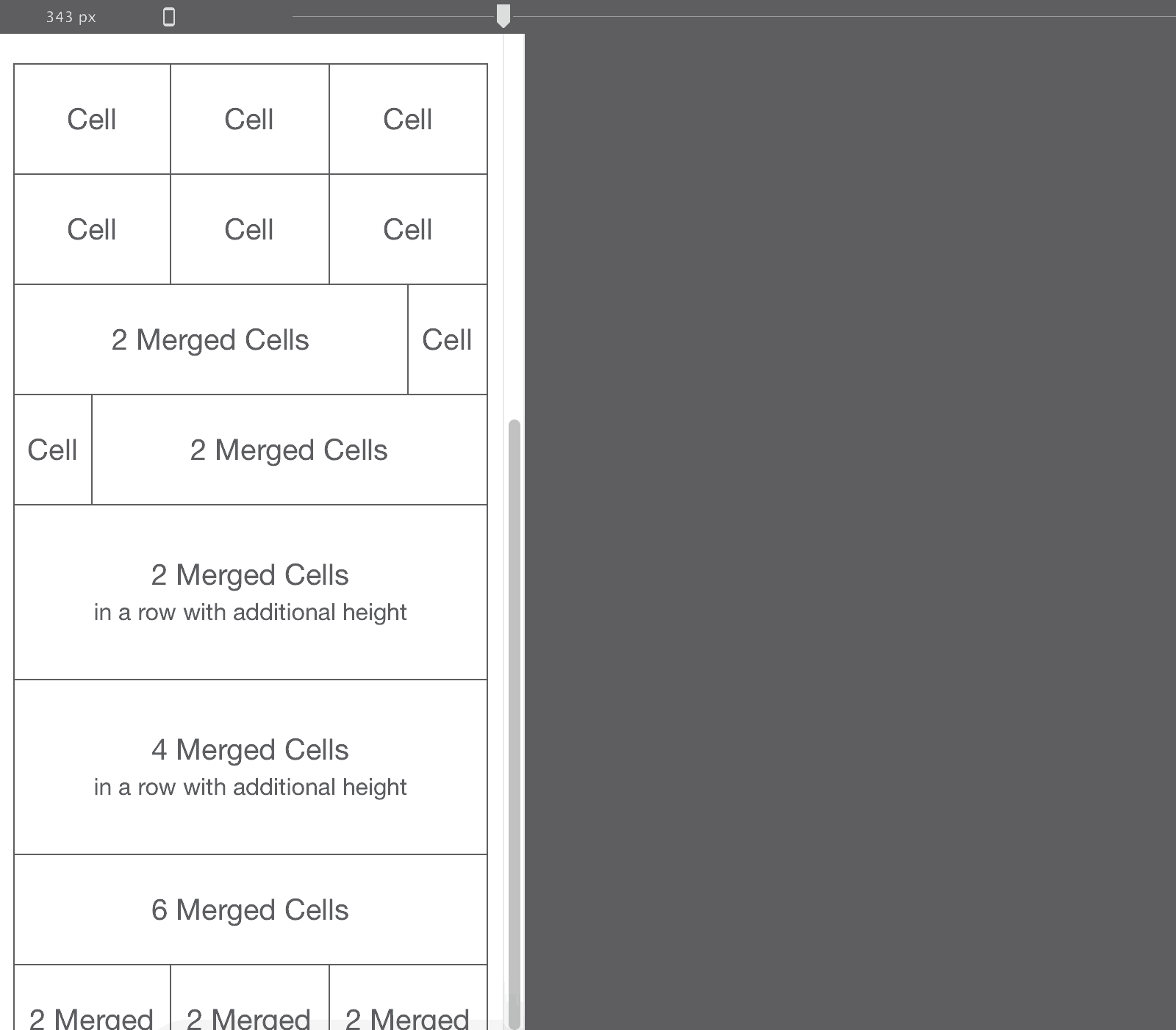
Responsive design uses grids to arrange content at any width. A grid is a set of columns and rows dividing the space, much like a spreadsheet — content sits in the cells, and cells can be merged or resized to fit.
In a fixed-width design those cells are static, always keeping their place and size:
In a responsive design they are dynamic, growing and shrinking with the display width. That flexible grid is the first ingredient:
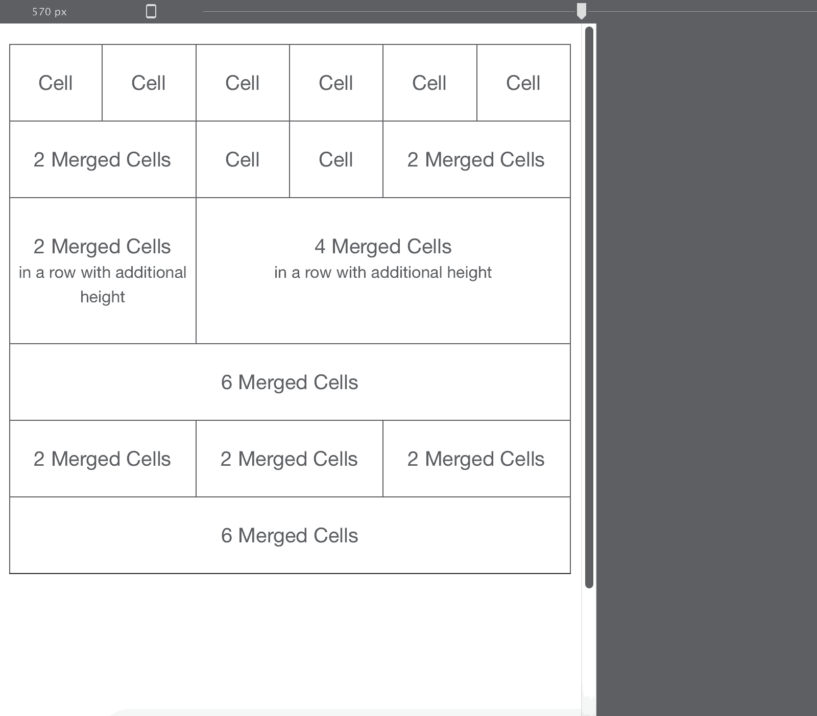
A fluid design uses relative measures — percentages — instead of fixed pixels. In the example above, each cell in the top row takes 1/6 = 16.67% of the total width, and the cell in the bottom row takes 6/6 = 100%, spanning the full width.
Why percentages, in practice
One of the first grid systems to gain a following was the 960 grid, whose default width was — you guessed it — 960px. With six cells across, each gets 960/6 = 160px. Content needs room to breathe, so a 10px margin left and right leaves 140px for the cell itself, and 20px of space between the content of adjacent cells.

Fixed like that, the layout can never use extra screen space on large monitors, and below 960px only part of it is visible:
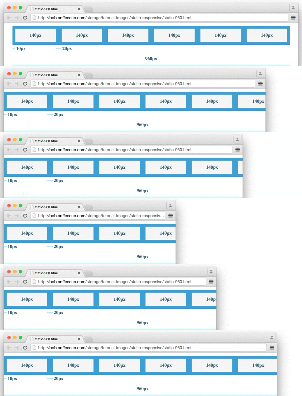
On phones, these layouts get zoomed out until they fit. The content is technically visible — but not readable, tappable or usable. Here is that example on an iPhone at actual width:
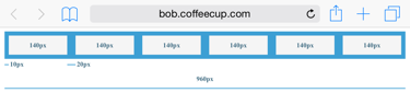
If that row were a navigation bar, picking the right button would be guesswork.
Making it flexible is simple arithmetic. Each 140px cell takes 140/960 = 14.58% of the width, and each 10px margin takes 10/960 = 1.04%. Below 960px, cells and margins now shrink together:
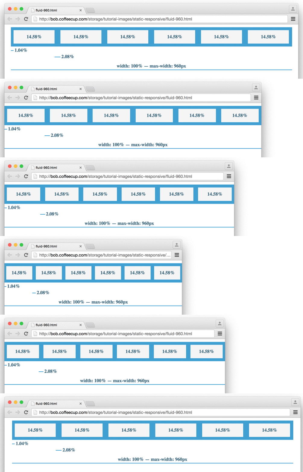
All the content stays visible at smaller widths, in proportion, with the layout structure intact.
Ingredient two: changes where they are needed
Shrinking works well within limits, but on a phone the design still ends up squashed — too small to read, tap or navigate. The fix is to stack the cells, using vertical space instead of forcing everything across:
Six cells in a row on a wide screen become three and three on a narrower one — the last three move below the first three. Repeat that through the design and columns drop below one another wherever they need more horizontal room.
How the change is triggered
Repositioning is done with media queries: CSS rules that apply only under specific conditions. If the display is narrower than 580px, for instance, a rule can tell the browser to put certain cells below each other instead of beside each other. The widths where those rules kick in are called breakpoints.
Breakpoints can go anywhere in a design, and they are not only for layout. The same conditional rules can carry any style change — different font sizes, smaller images for mobile, anything.
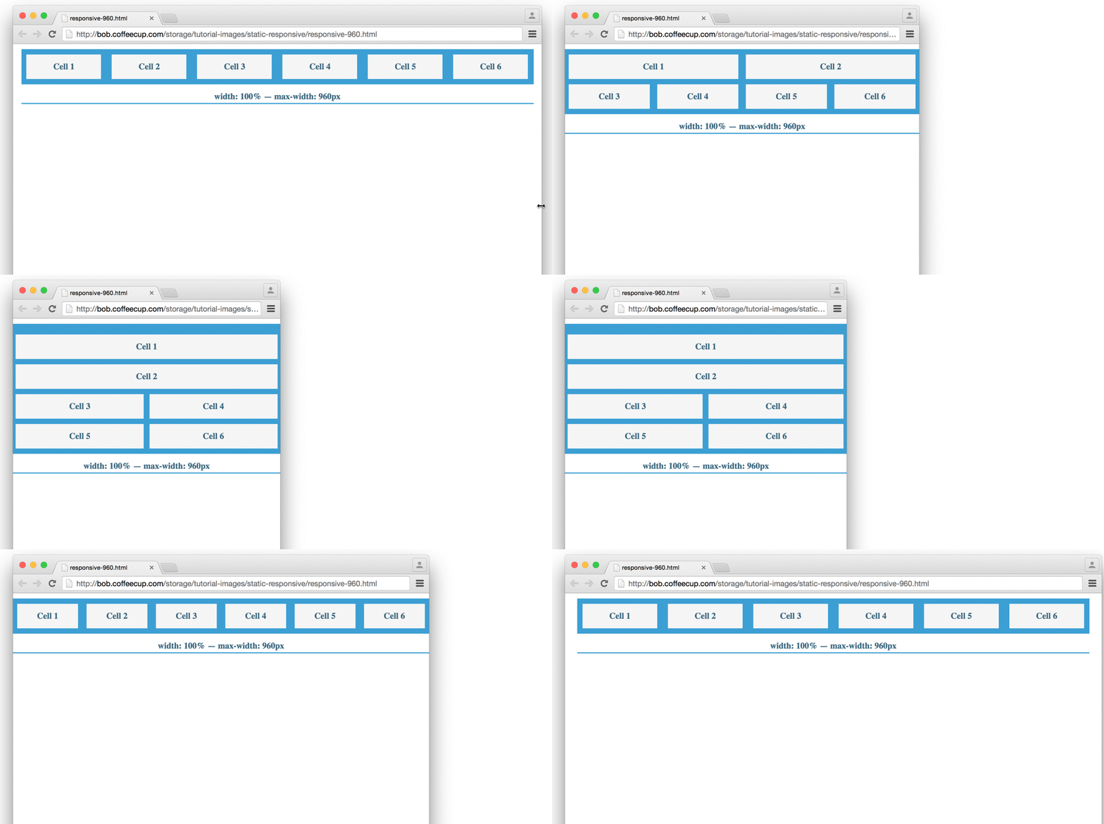
In that example, cells 1 and 2 take half the width each at 675px, while the others take a quarter below them. At 550px the first two go full width and stack; the rest take half, so cells 5 and 6 stack below. From 400px every cell takes the full width.
Why aren’t all cells treated the same? Partly to show what breakpoints can do — but in a real design there is often a reason. The first cells might hold the most important content, and so earn more room.
When should I add a breakpoint?
This is the question that comes up most, and the answer is refreshingly simple.
Hand-coding all of the above — the layout, the resets, the percentages, the classes for each breakpoint — takes hours. In Site Designer it is a few clicks, because the app writes the CSS while you drag the slider.
Keep the two key concepts in mind — flexible columns, plus layout and design changes at breakpoints — and the rest is practice.
Next steps
- The width slider — test your design at every width
- Custom breakpoints — add and manage your own
- Mobile-first vs. desktop-down — which direction you design in