
Building the Visions template
Browse tutorialsReady to build something real in Site Designer? Learning a new app can be daunting, so this walkthrough takes you through one complete web page from the first empty canvas to the finished footer. Use the result as the starting point for your own project, or treat it as a guided tour of the controls you will reach for every day.
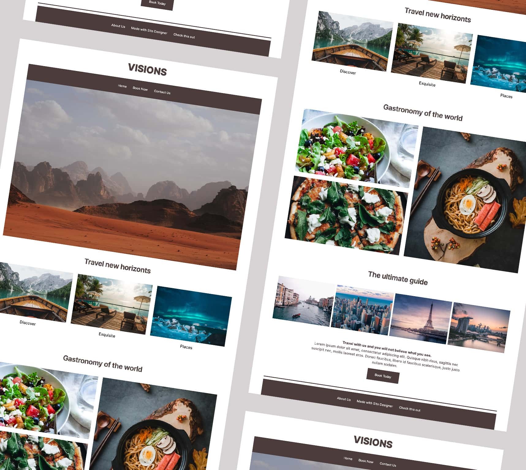
- What you'll build
- A single responsive page with a header, a navigation bar, a full-bleed hero, two CSS Grid galleries, a Flexbox photo row and a footer.
- Time to complete
- 45–60 min estimated
- Prerequisites
-
- Start from the Blank Frameworkless Desktop Down template — the styles land in the wrong breakpoints on any other starting point.
- No CSS knowledge needed, but it helps to have read Understanding the CSS selectors.
You’ll learn: class names, the Dimensions controls, typography, breakpoints, Flexbox positioning, CSS Grid columns, and grid area placement.
Download the finished projectOpen it in Site Designer to inspect any step up close — or build along from scratch and keep it as a reference. The file includes the completed project and all of its image resources.
1 · Start with a blank canvas
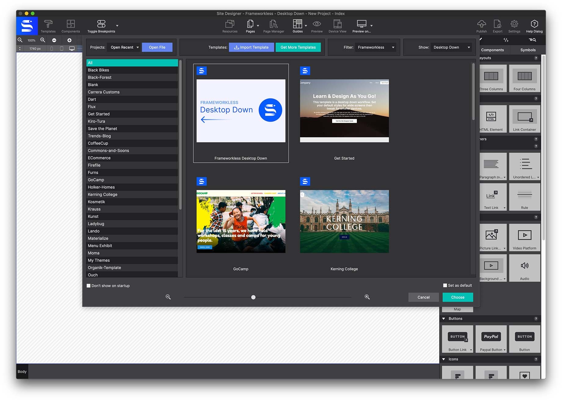
Select the Templates toolbar icon and choose the Blank Frameworkless Desktop Down framework. This launches an empty canvas to work from.
2 · The header region
Go to Content pane → Elements → Advanced Container and pick a Container Header. Click to add it, or drag and drop it onto the canvas.
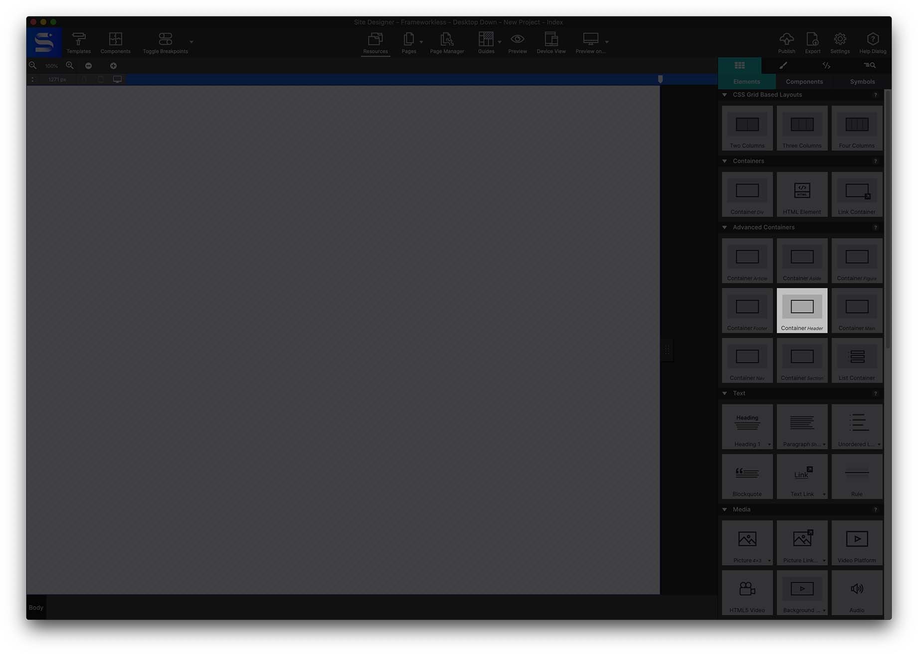
A regular container would also work, but for the sake of semantics the Header Container is the better choice — it tells the browser exactly what that content is.
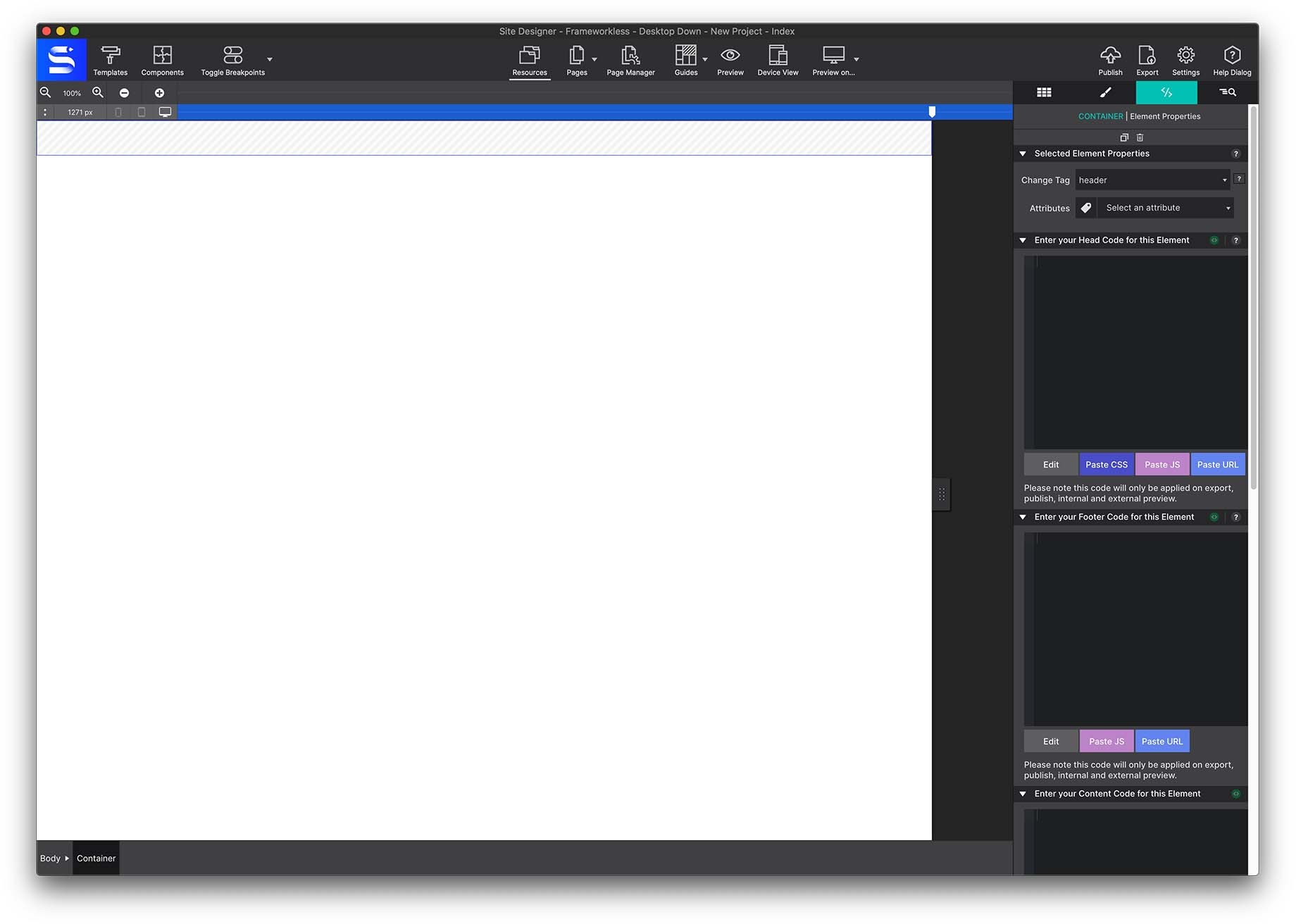
With the element on the canvas, give it a class name. Go to Styles pane → Class Selector → Type Class and enter header-section.
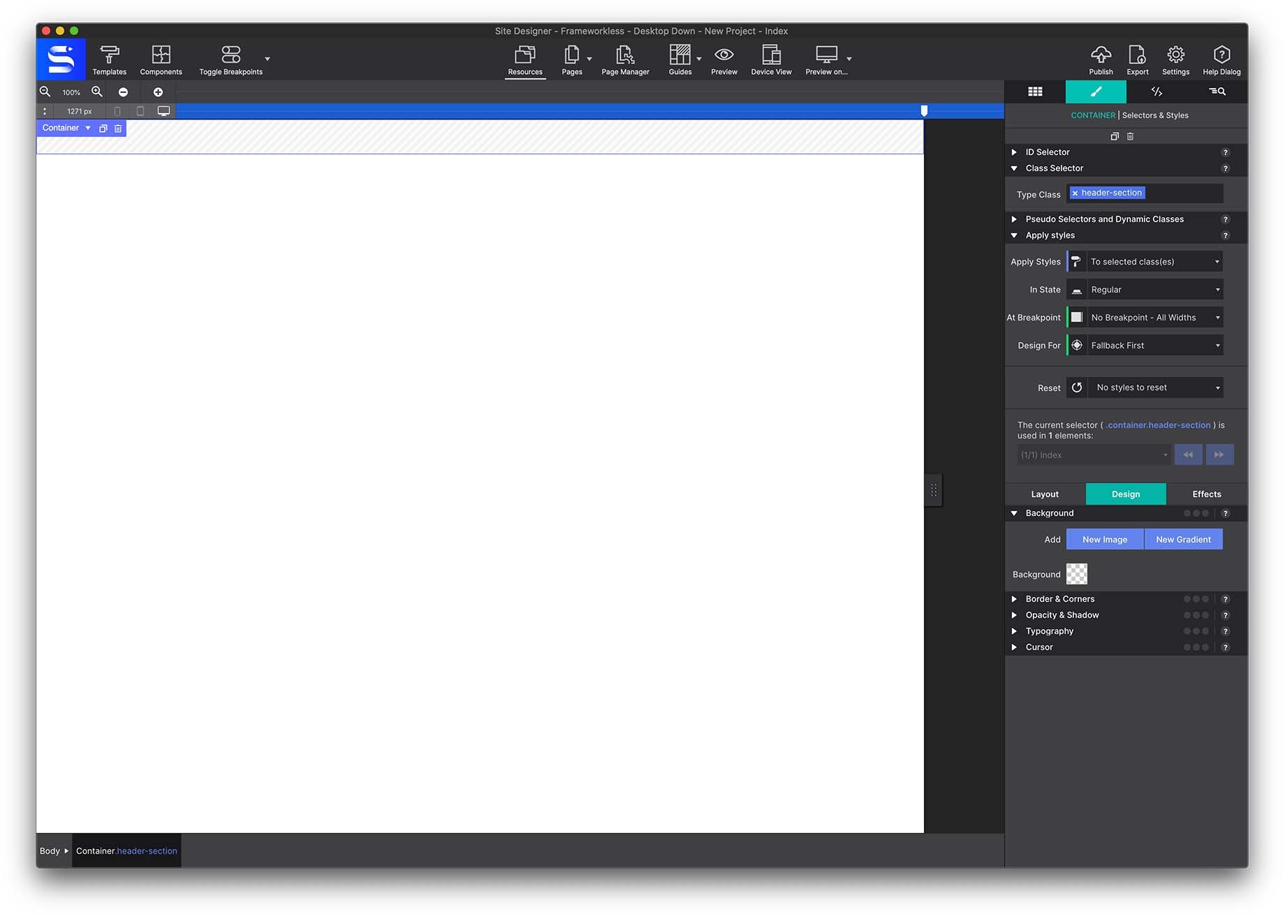
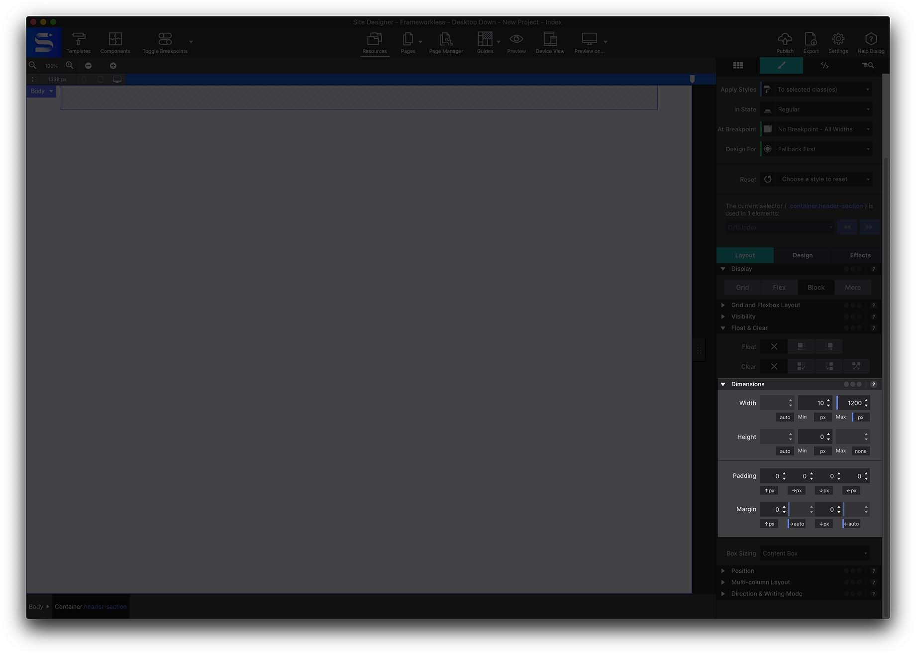
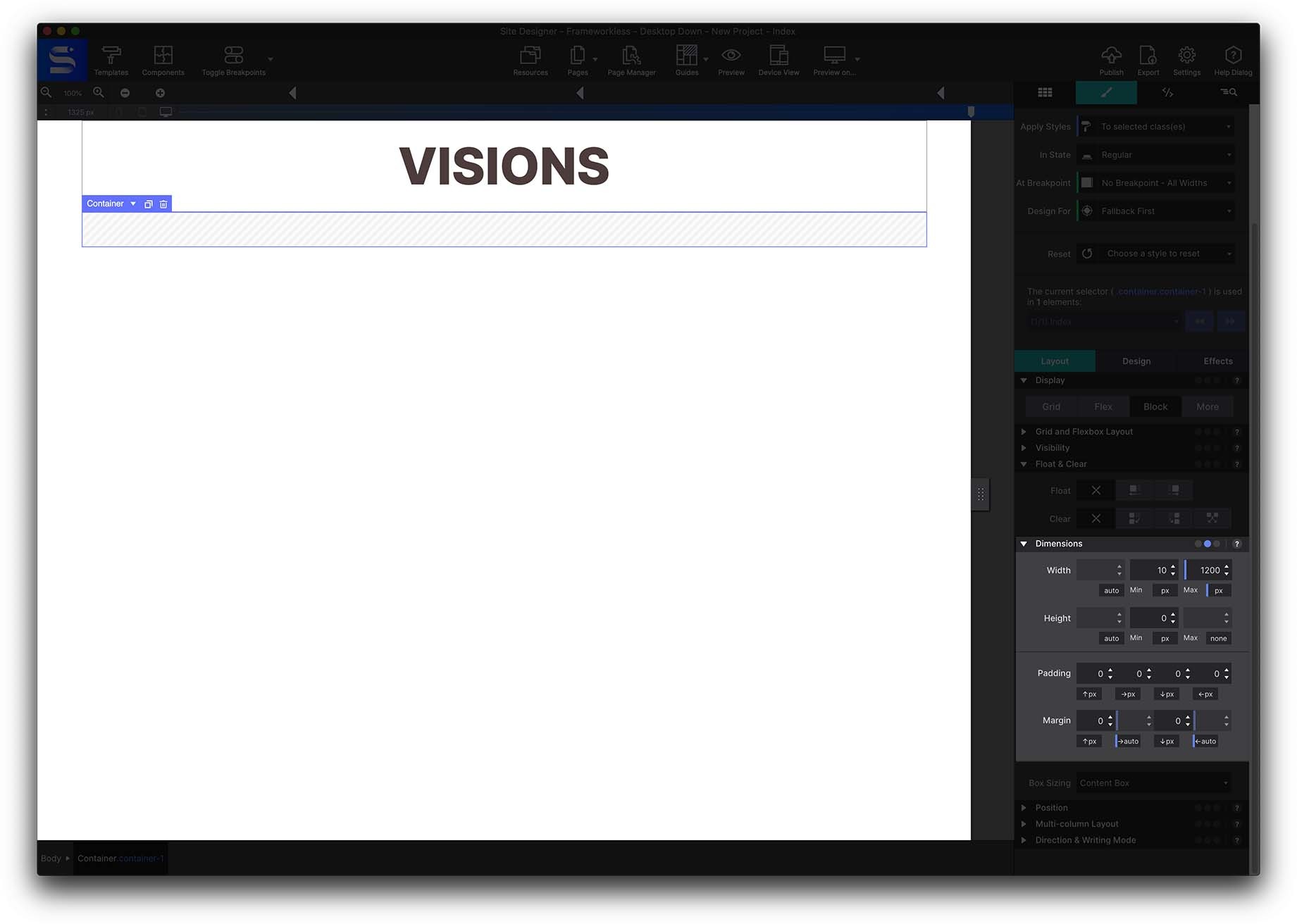
Next, give the container a maximum width. In Styles pane → Layout → Dimensions, set the max width to 1200px — this defines your viewing area. Then, still under Dimensions, set the left and right margins to AUTO so the container stays centred whatever the screen size.
3 · The page heading
From Content pane → Elements, add a Heading H1 inside the container and give it the class name h1-heading.
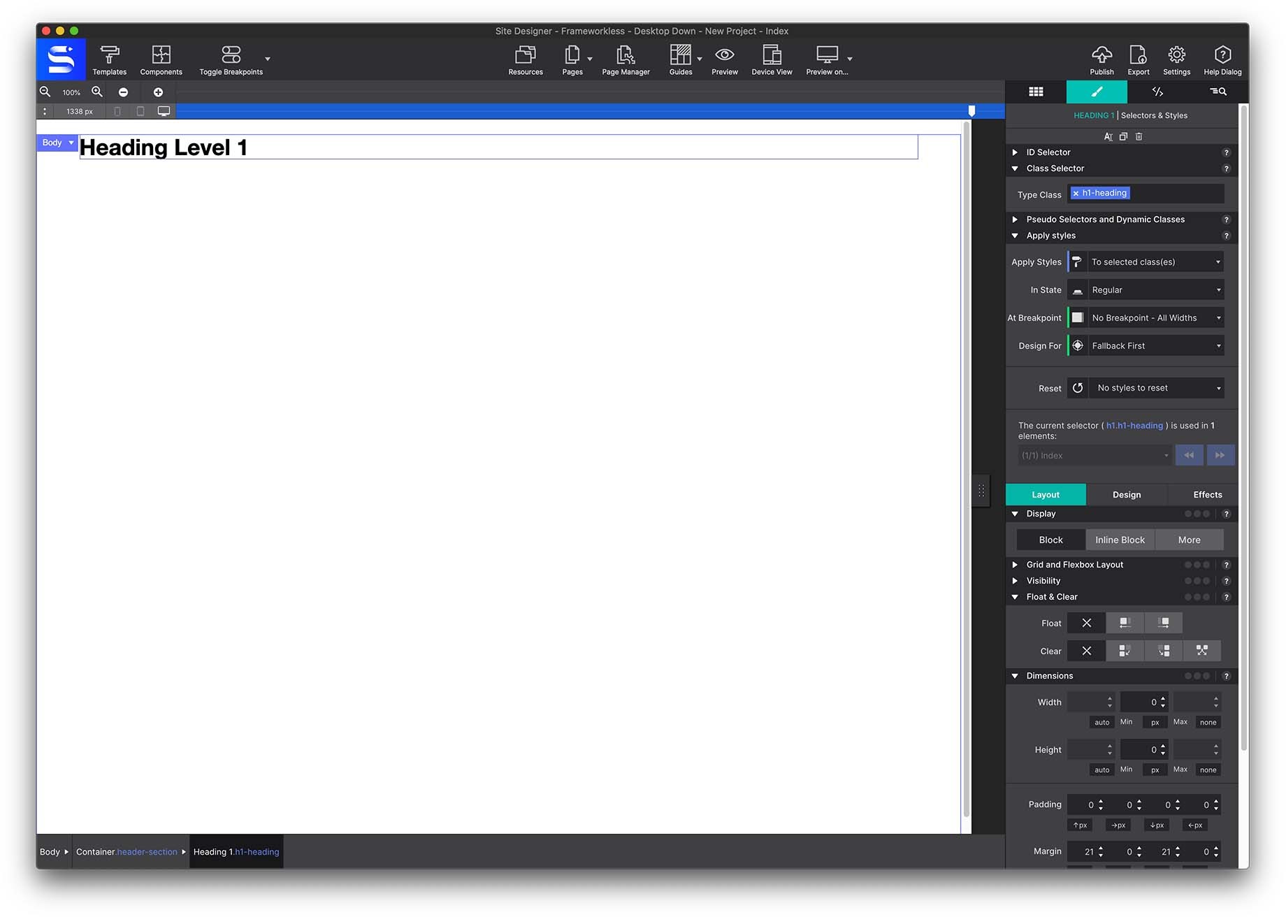
To edit the text, right-click on the canvas and choose Edit Text, or double-click the text to open the Text Editor. Replace the placeholder with the word Visions.
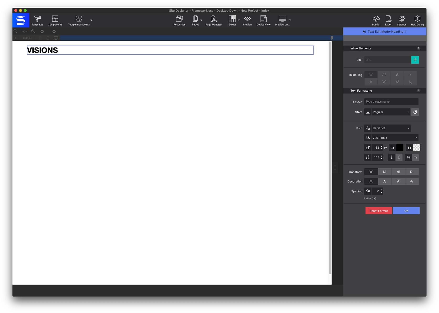
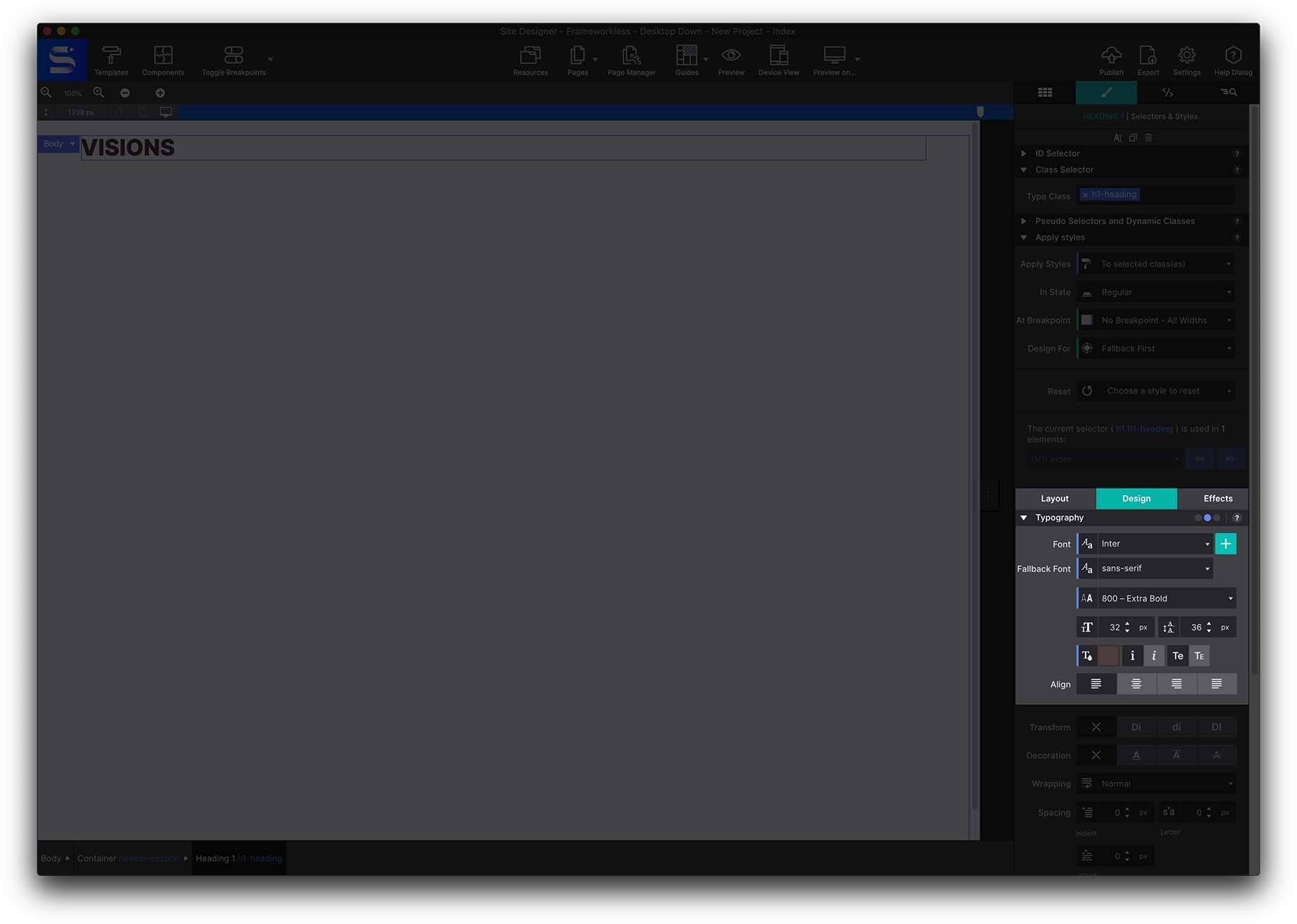
Click outside the text to close the editor. Now style the heading properly, from Styles pane → Design → Typography:
| Control | Value |
|---|---|
| Font | Inter |
| Fallback font | Sans-serif |
| Weight | 800 Extra Bold |
| Size | 72px |
| Color | #4b3c3c |
| Transform | Uppercase |
4 · Make the heading responsive
Along the top of the canvas sits the Breakpoints Bar. This is where you inject different layouts and styles per screen size: move the slider to a width, click the bar to add a breakpoint, then make your changes. Those changes apply to that size and below. The exact pixel position shows at the far left of the bar.
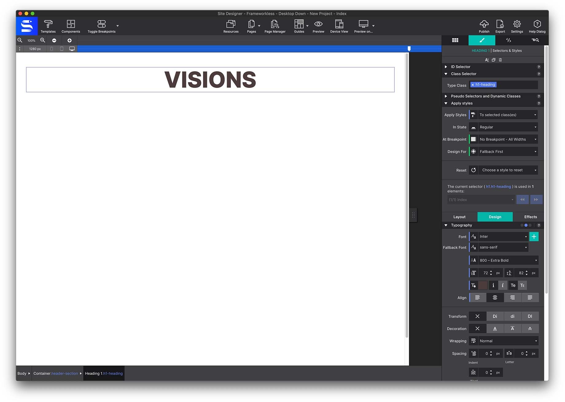
Add breakpoints at roughly 1280px and 756px.
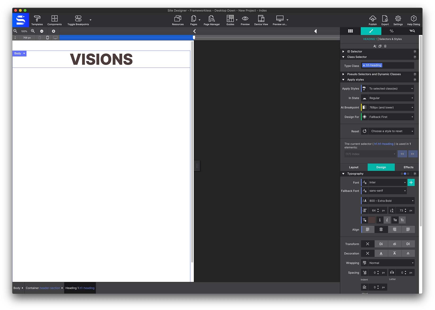
With the slider to the left of a breakpoint, adjust the typography. Font size is the most common thing to change — smaller screens rarely need 72px type. At the first breakpoint, drop the heading to 64px.
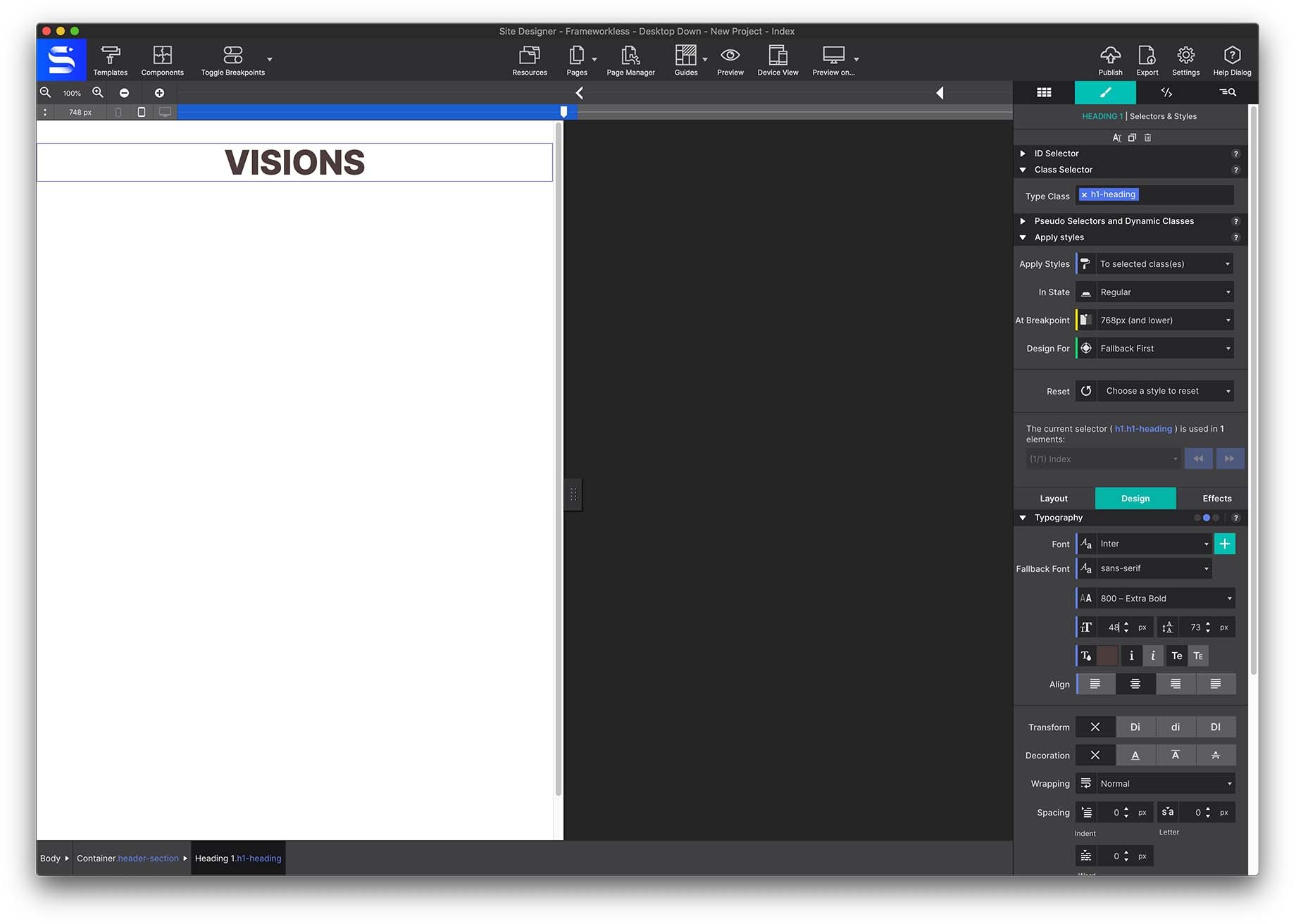
At the smaller breakpoint, take it down to 48px.
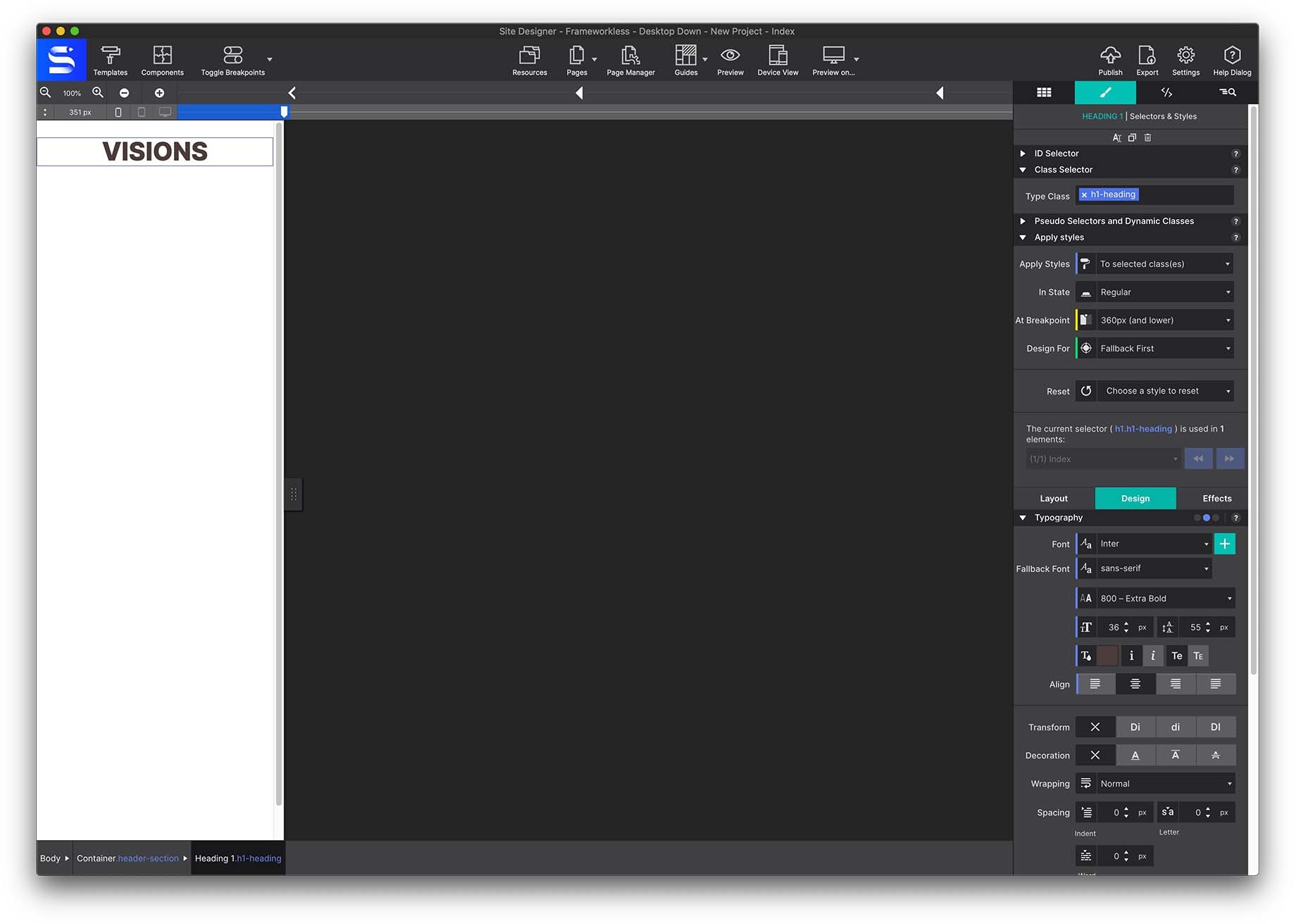
Now drag the slider between the breakpoints and watch the size change on its own. Still too large for phones? Add another breakpoint further down and lower it again.
5 · The navigation menu
The menu is a container plus three text links. Start with Elements → Advanced Containers → Container Nav. This is the parent — the element that holds the children (the links) and controls how they are positioned.
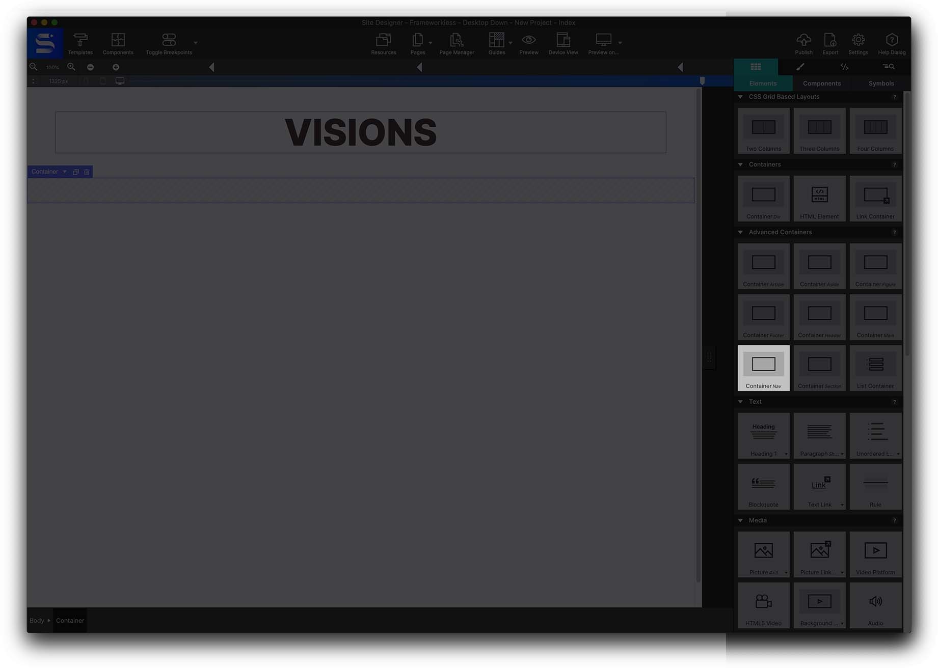
Give it the class name nav-section, then apply the same treatment as the header: max width 1200px and left/right margins set to AUTO.
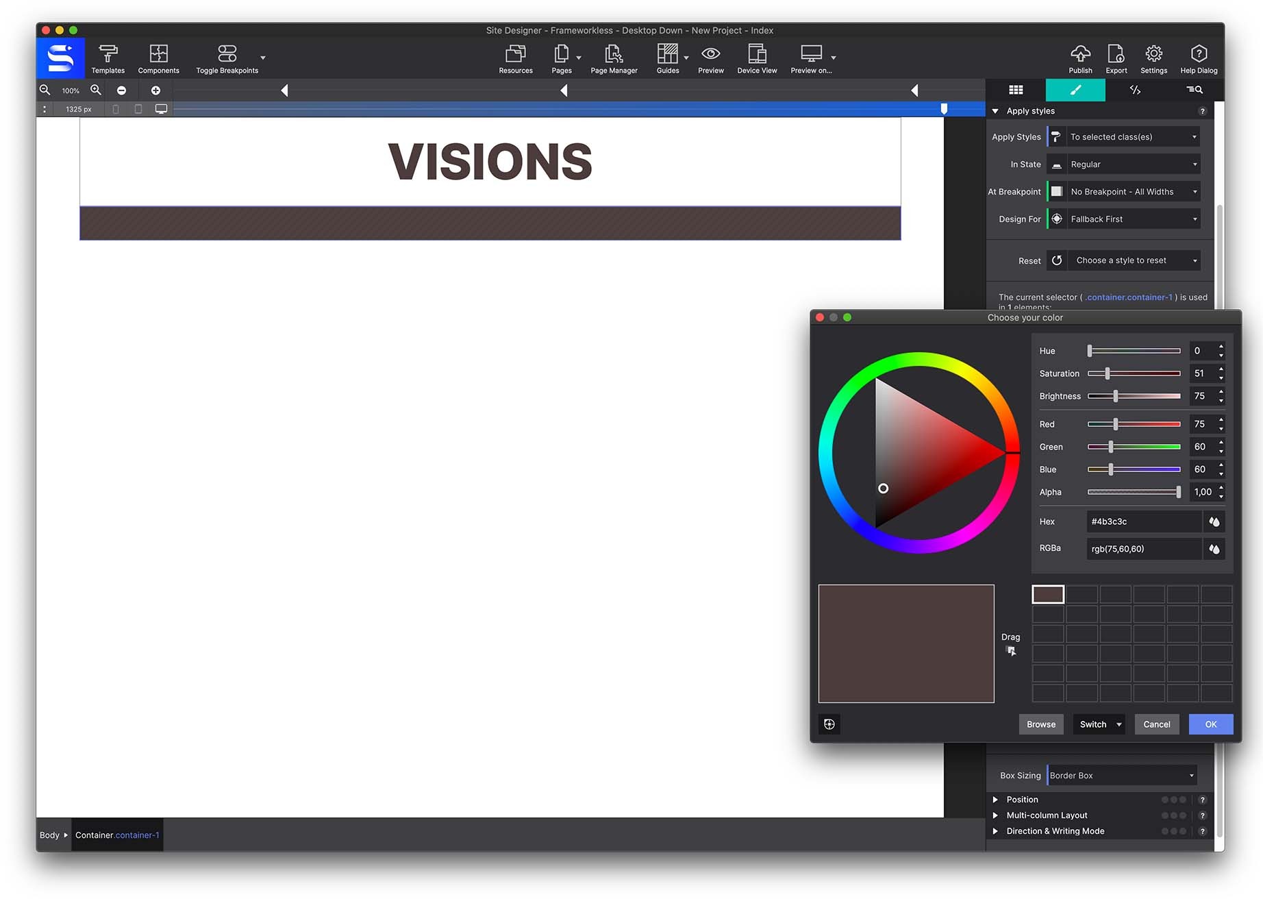
Add a background colour from Styles pane → Design → Background. Click the colour box to open the picker — use the wheel or type an exact value. Here it is #4b3c3c.
With the container configured, go to Content pane → Text elements and add a Text Link element inside it. Give it the class name navlink-menu.
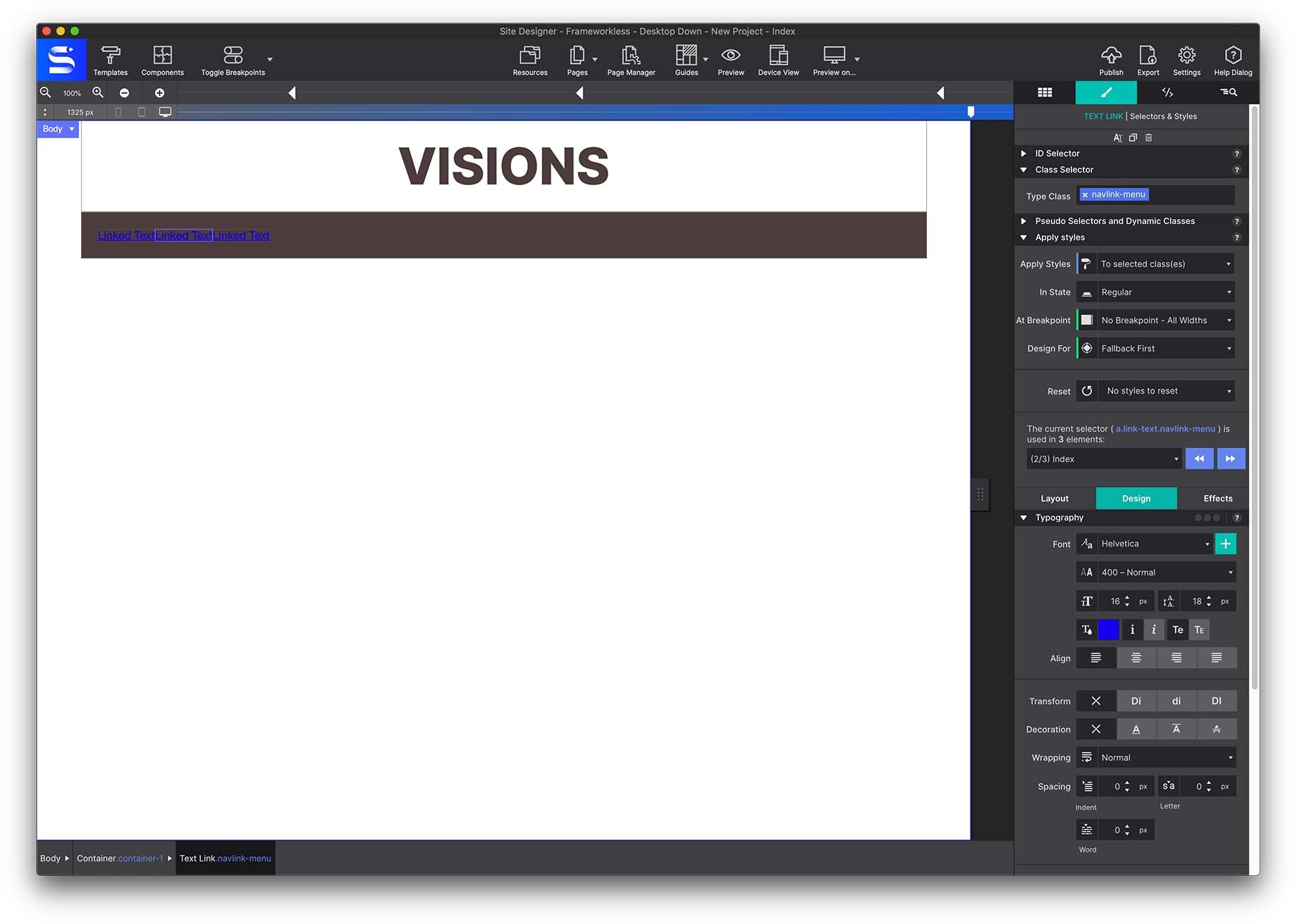
Use the Duplicate icon at the top of the panel twice, so you end up with three links.
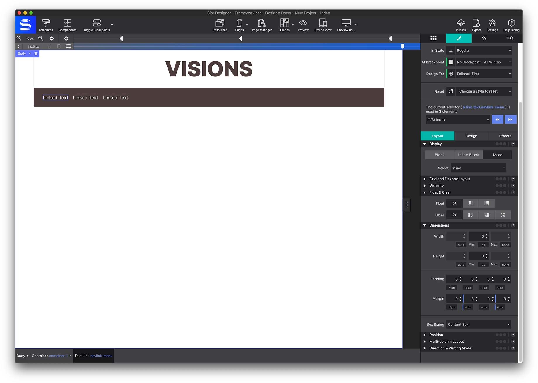
Double-click each one on the canvas and change the text to HOME, BOOK NOW and CONTACT US.
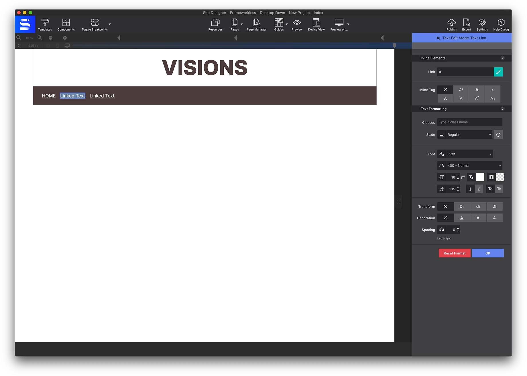
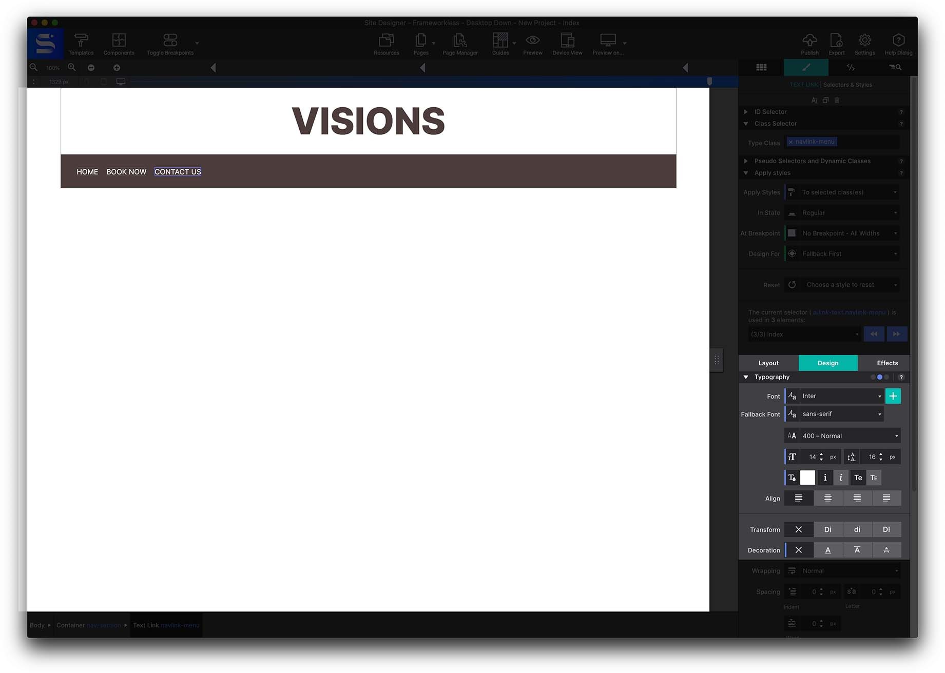
Style them from Styles → Design → Typography: font Inter, fallback sans-serif, colour white.
Link destinations go in Element pane → HREF. For another page in the project, enter the page name — see the Page Manager for adding and naming pages.
Now position the links with Flexbox. Select the nav-section container from Inspector pane → Element Tree, then go to Styles pane → Design.
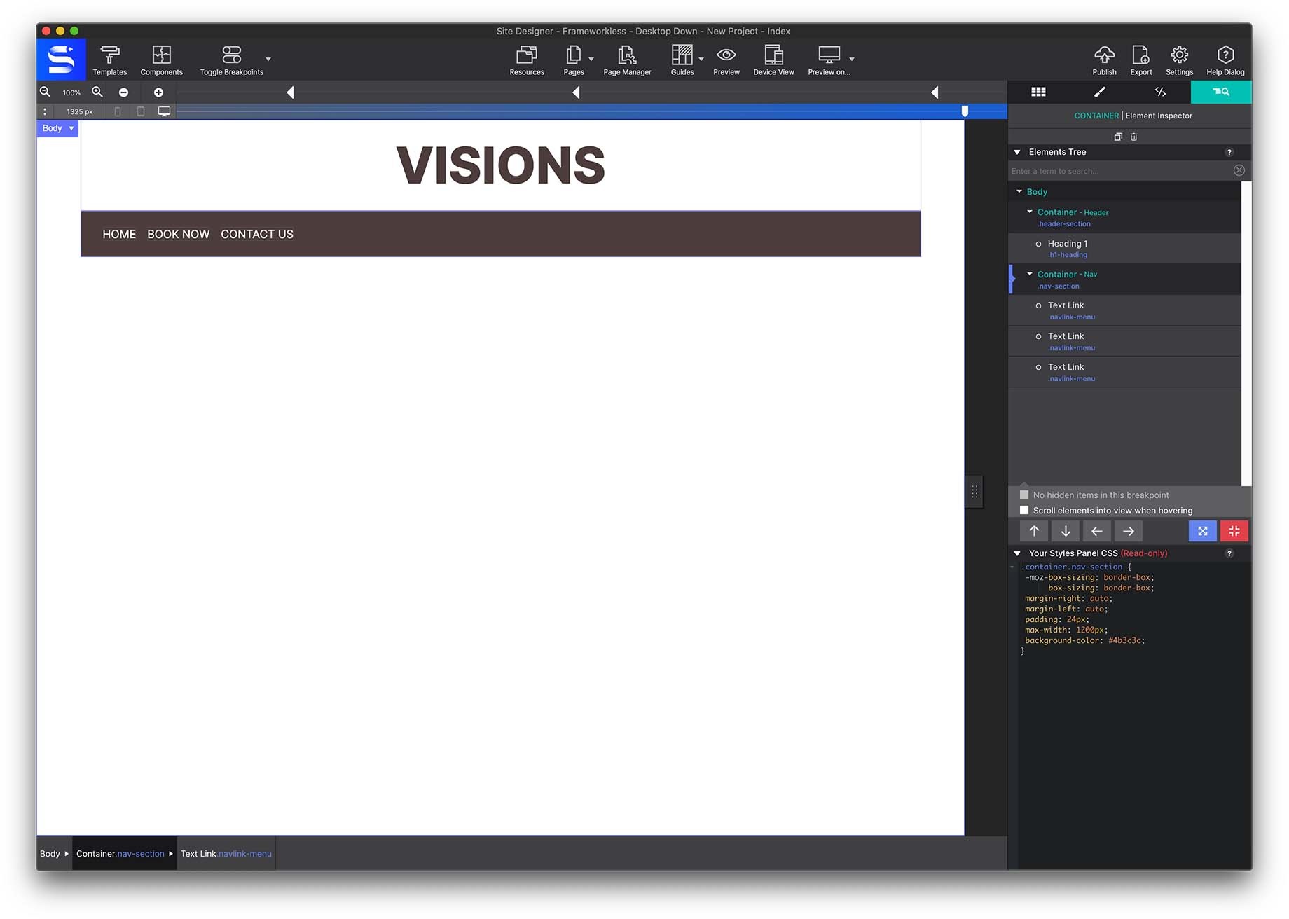
Apply 24px padding on all sides under Layout → Dimensions, then set Layout → Display → Flex.
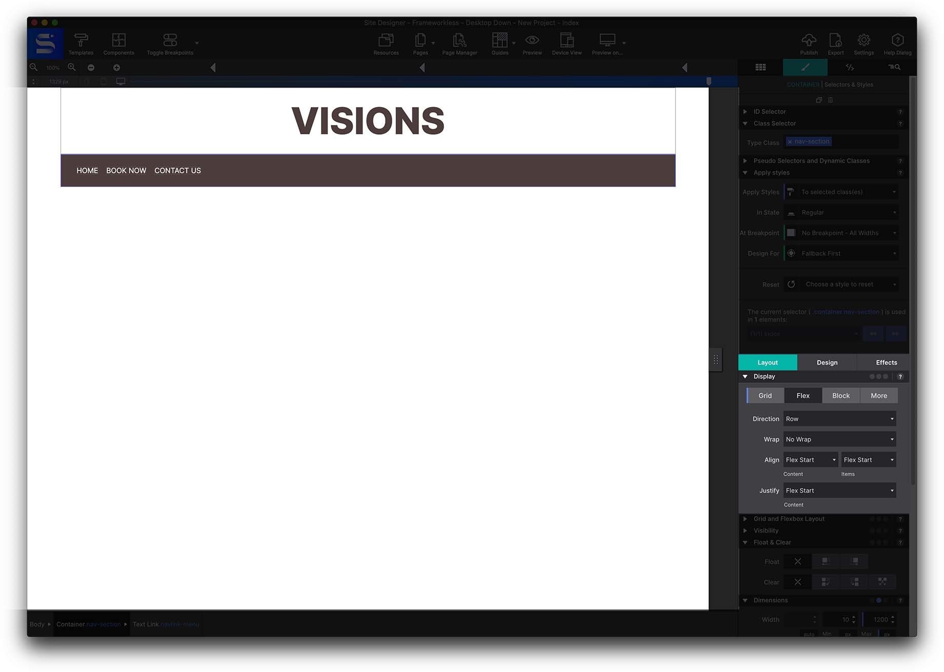
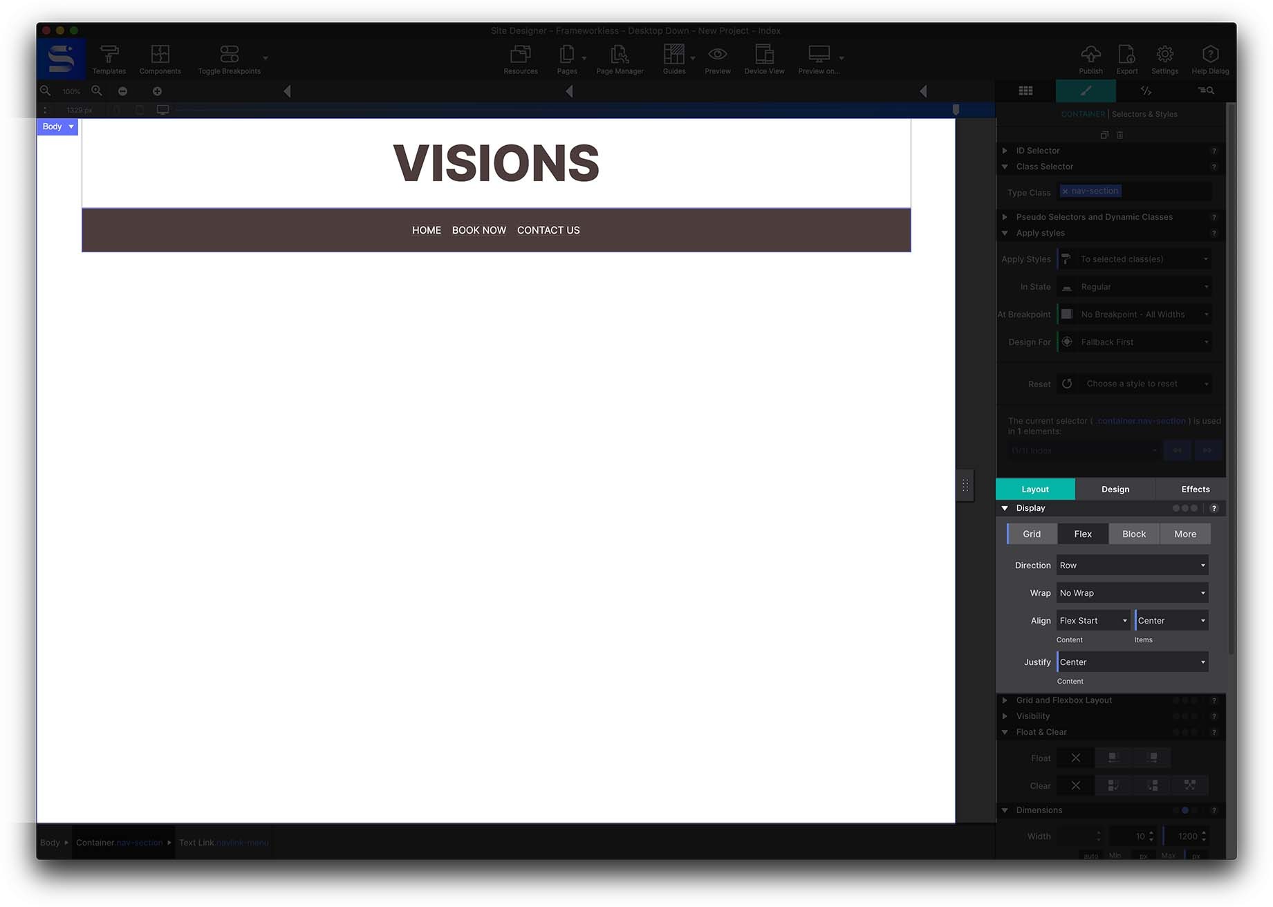
Because this is a desktop-down design, keep the elements in a row, and set both Align and Justify to center. If you wanted the menu stacked on mobile, you would switch row to column at that breakpoint.
6 · The hero image
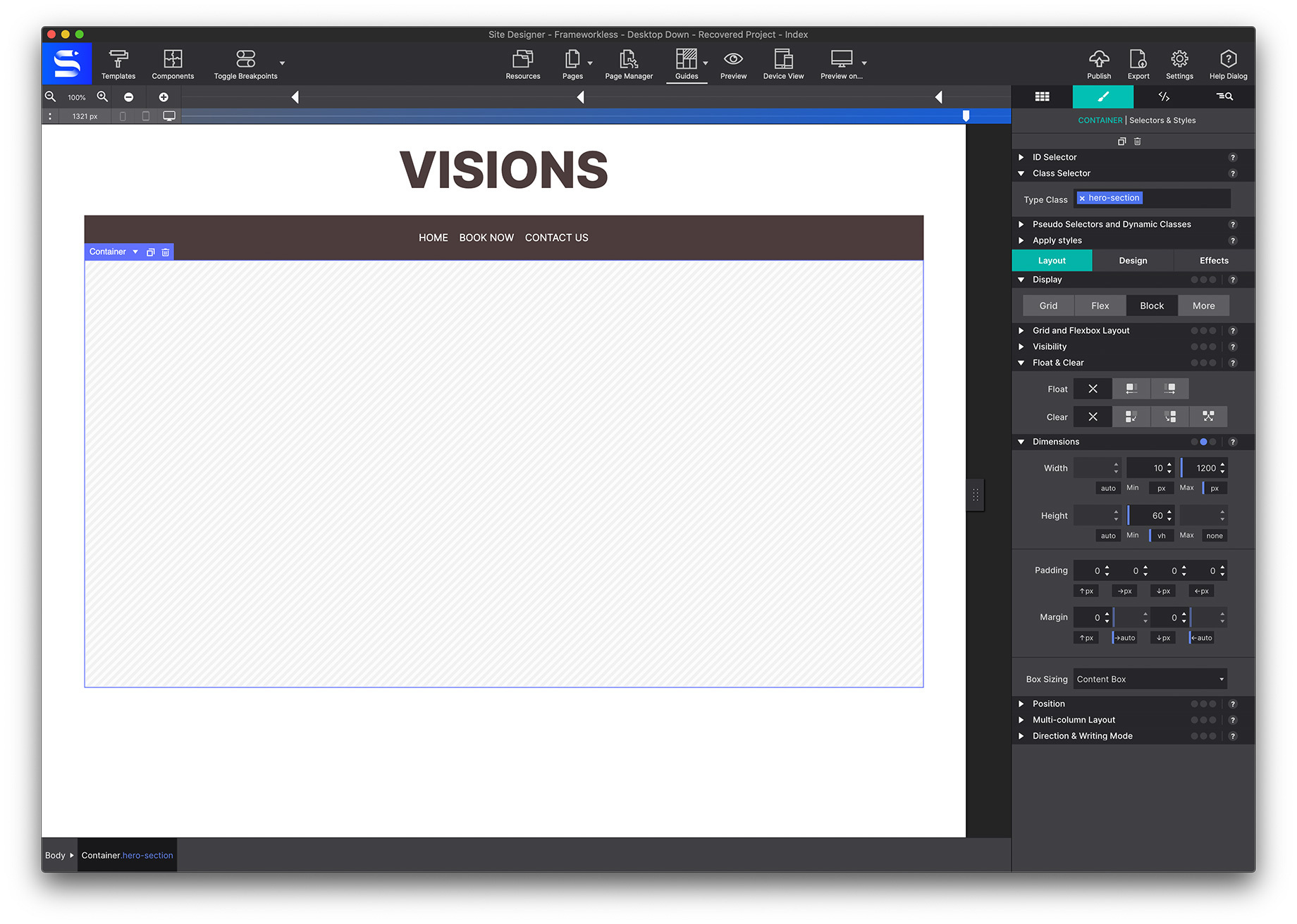
Add a Main container to the canvas — this becomes the hero section.
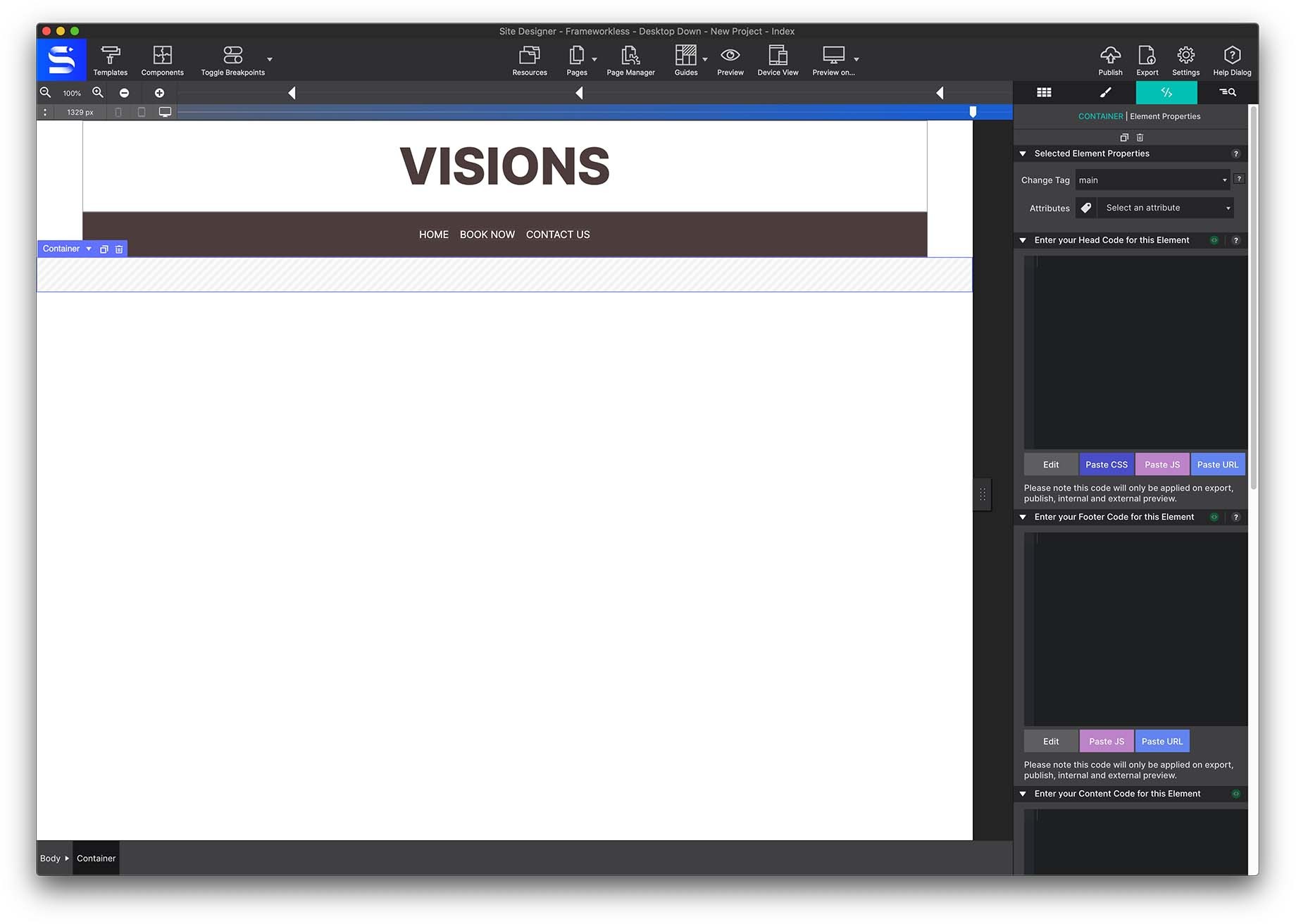
Give it the class name hero-section, then size it from Styles pane → Layout → Dimensions.
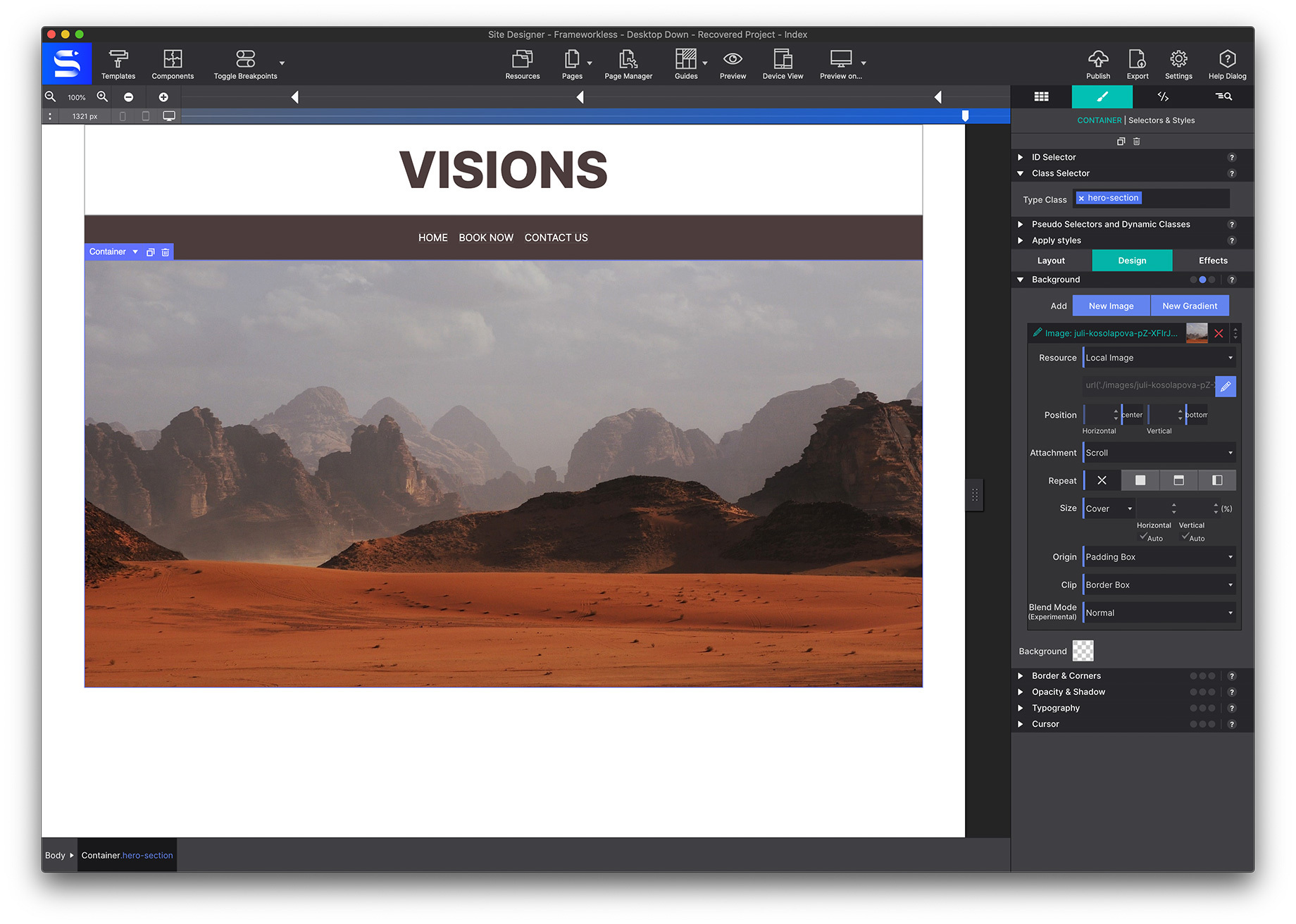
To use an image, import it first: click the Resources toolbar icon, hit the green Add Files and Folders button and pick the image from your computer.
Back on the canvas, select the main container and go to Styles pane → Design → Background → Add Images → Local Image. Once it is in, you can set the size and position. This example keeps the defaults: position center, size cover.
7 · The CSS Grid section
This section uses CSS Grid to place three images side by side. Grid is simply another way to position items — here, three equal columns.
Start with a regular container, set its Flexbox alignment to center (so everything inside sits centred), and name it css-grid-section.
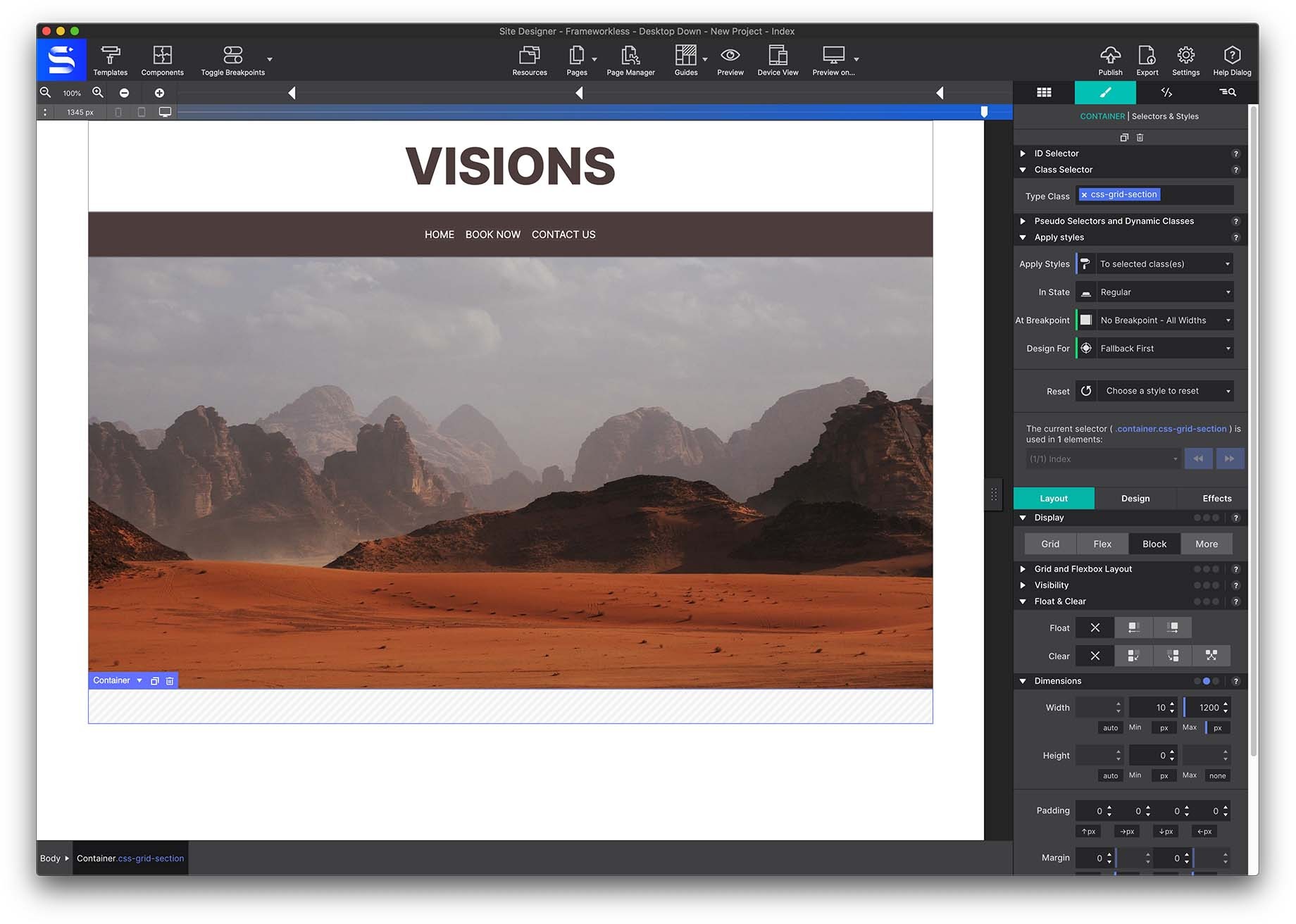
Add a Heading H2 with the class section-title and change its text to Travel New Horizons.
Next comes the grid itself, and the parent/child relationship matters here. The grid is the parent container; the containers, pictures and text inside it are the children. What you configure on the parent governs the children.
Add a container with the class name css-grid-container.
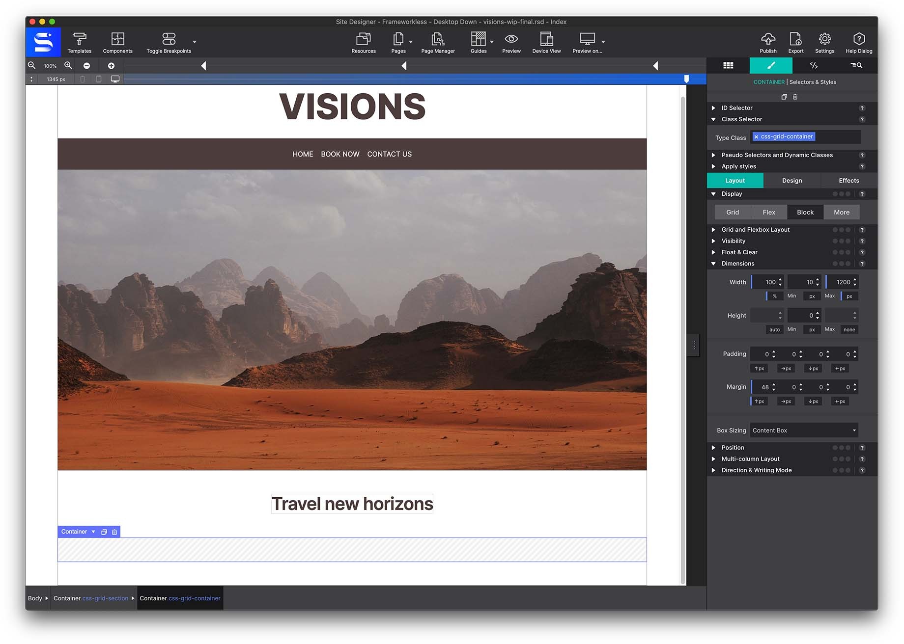
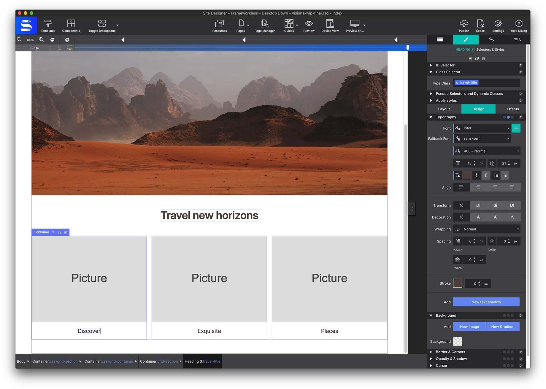
Inside it, add three more containers with the class grid-section, and put a Picture element in each. Hover a picture and use the swap icon to change the resource, or use the Resource dropdown on the Element pane.
Set each grid-section to Layout → Display → Flex so its contents centre.
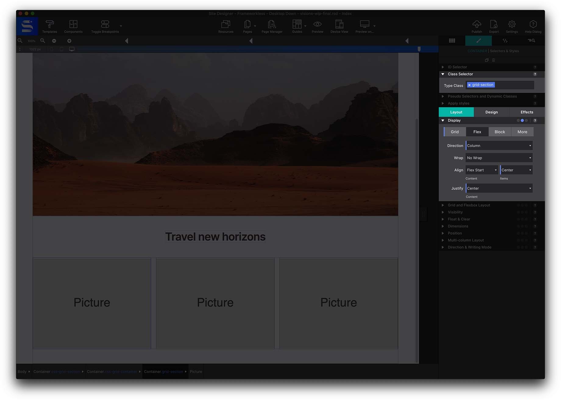
Now select the parent css-grid-container from Inspector pane → Element Tree and set Styles → Layout → Display → GRID.
A CSS Grid dialog appears at the right of the toolbar. Use the +/- controls to shape the grid — add 3 columns with the + at the top right.
Columns default to auto, which sizes them to their contents. Here you want three equal columns, so set each one to 1fr, and add a 24px column gap.
Because this is desktop-down, that layout now applies to desktop and tablet — but three columns is too many for a phone. Move the slider to the mobile breakpoint, delete two of the columns to leave one, and set a 24px row gap instead.
8 · Grid area placement
Now take Grid a step further with named areas, which unlock almost any layout you can picture.
Duplicate the previous section and rename the parent container’s class to css-grid-container-areas.
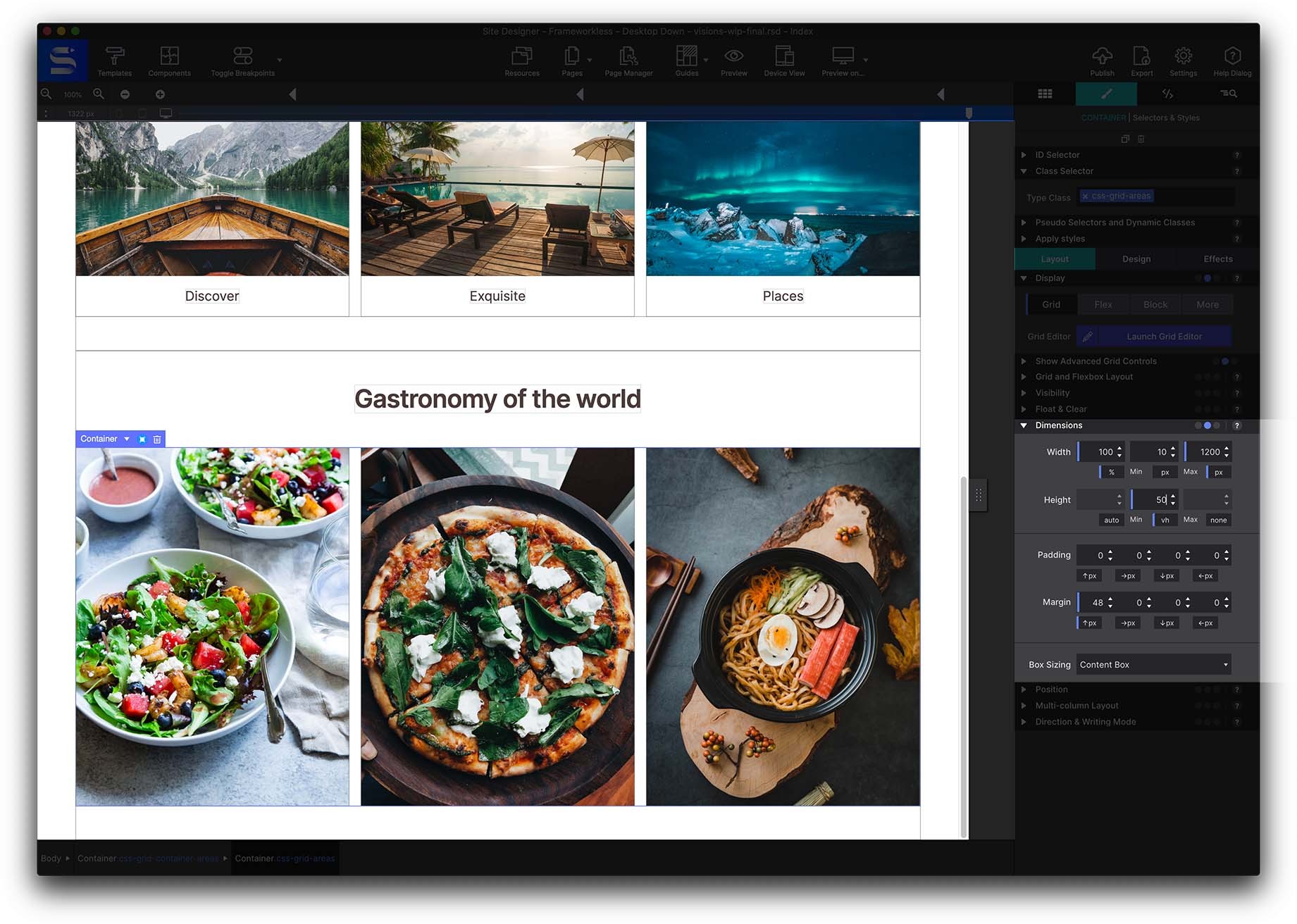
Give each of the three child containers its own class — area-1, area-2 and area-3 — then set a background image on each from Styles pane → Design → Background.
Give the parent a min-height of 50vh (half the viewport height) so the changes are easy to see, then use the dropdown under Styles pane → Layout → Grid and Flexbox Layout and select Grid Area Based Placement.
A new field appears for each container: name them salad, pizza and ramen.
The canvas may look scrambled at this point — that is expected. Select the parent container, go to Styles → Layout → Grid and open the Grid dialog. Click into the centre of each grid area and type the name you assigned. Remove the dot from the typing window as you go; a dot means “leave this cell empty”.
From here, experiment: add more columns or rows and repeat a name across cells to make that item span them. Click OK and the layout appears on the canvas. Every breakpoint can have its own arrangement.
9 · A Flexbox photo row
Copy the previous section again to reuse its centred container and H2 heading, then add a container with the class flexbox-section.
Insert a Picture inside it with the class name guide-photo-link and give it 8px margins on all sides from the Dimensions section. Duplicate it three times for four images total.
Set Styles → Layout → Display → Flexbox on the container and experiment with Row and Column, plus Align and Justify. This is the part worth playing with — trying out layouts costs nothing when you don’t have to write the syntax by hand.
10 · The footer
Copy the menu from the header and duplicate it, changing the class names and giving it footer properties.
Then open the Page Manager from the top toolbar. It holds the fields that keep a project organised: page titles and descriptions for SEO, analytics connections, favicons and more.
Where to go next
Site Designer lets you work with CSS visually — these code-free controls exist so you can try new styles and layouts without hand-coding them first.
- CSS Grid controls — the full grid reference
- Breakpoints — everything the breakpoint bar can do
- CSS selectors — how classes, IDs and states fit together