
The Picture element and responsive images
The Picture element does more than show an image. It can stand in as a wireframe placeholder, work as a link, and — the part that matters here — change which file it loads based on the visitor’s screen.
Why a plain image is not enough
Most website images are prepared for desktop viewers at a resolution that keeps them sharp. Those same files are usually far too large for phones and tablets. Ship one to a mobile visitor and you spend their bandwidth on pixels they will never see.
There is a second problem, and it is about design rather than weight. A large picture full of detail, scaled down to a narrow screen, loses everything that made it worth using. The viewer could pinch and zoom, but almost nobody will — and asking them to goes against the whole point of responsive design.
The Picture element solves both. The browser picks the appropriate version from your resources — a wide overview shot for desktop, a cropped and lighter one for mobile — and each visitor gets the version suited to their screen.
Optimize before you import
File size matters, especially on image-heavy pages where load time compounds. Site Designer warns you whenever you add a resource over 1 MB — and 1 MB is already too big.
Three things determine the outcome:
- Dimensions. Resizing the image to the size it will actually be displayed at cuts the most weight of anything you can do.
- Format. JPEG strikes the best balance for photographs. PNG is for transparency, typically logos and vector-style artwork. GIF is for animation.
- Quality. Most export tools let you trade a quality percentage for a much smaller file.
Adding a Picture element
Start with the slider at the default breakpoint for your workflow, so your layout and style choices become the baseline. You can adjust at other breakpoints afterwards.
From the Content pane, click or drag a Picture or Picture Link element onto the canvas. A placeholder graphic appears until you set a source: go to Element pane → Selected Element Properties → Picture and use the dropdown to choose a local or online image source.
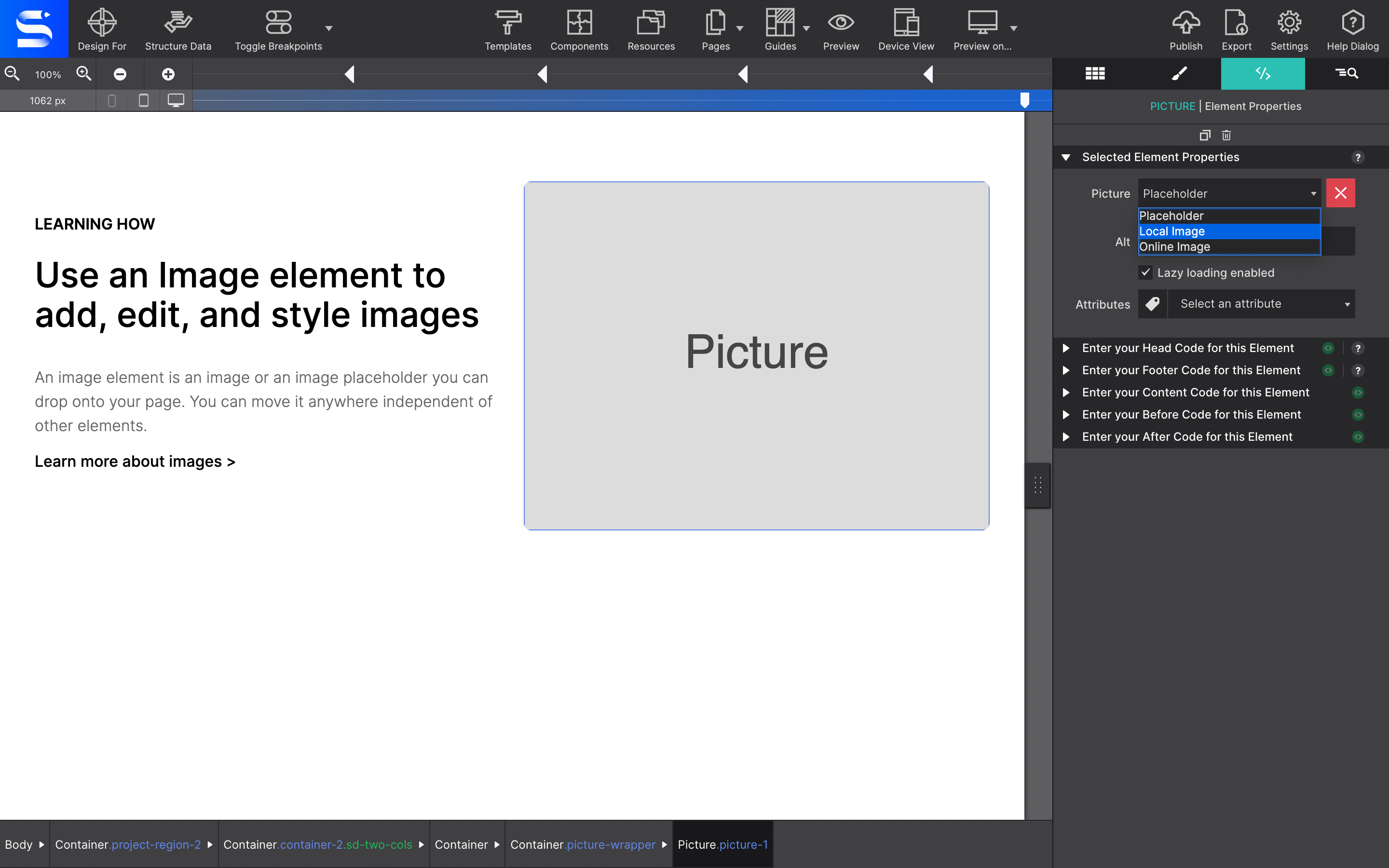
Choosing a local image opens the Resource dialog, where you import graphics into the project file. Organise them into folders — it pays off as the project grows.
Two more properties in the same panel are worth setting every time:
- ALT — alternative text, shown if the graphic fails to load and read aloud by screen readers. Essential for accessibility.
- Lazy Loading — delays loading the image until the visitor scrolls it into view. On a picture-heavy page this makes a dramatic difference to page speed.
Sizing and positioning
Positioning lives in Styles pane → Layout: the usual Block and Inline Block, or Flexbox and CSS Grid for placing the image precisely.
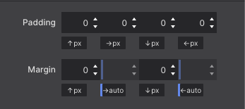
Under Dimensions you set the actual width and height. To centre a picture, give it display: block and set both the left and right margin to Auto.
Fitting the image inside its box
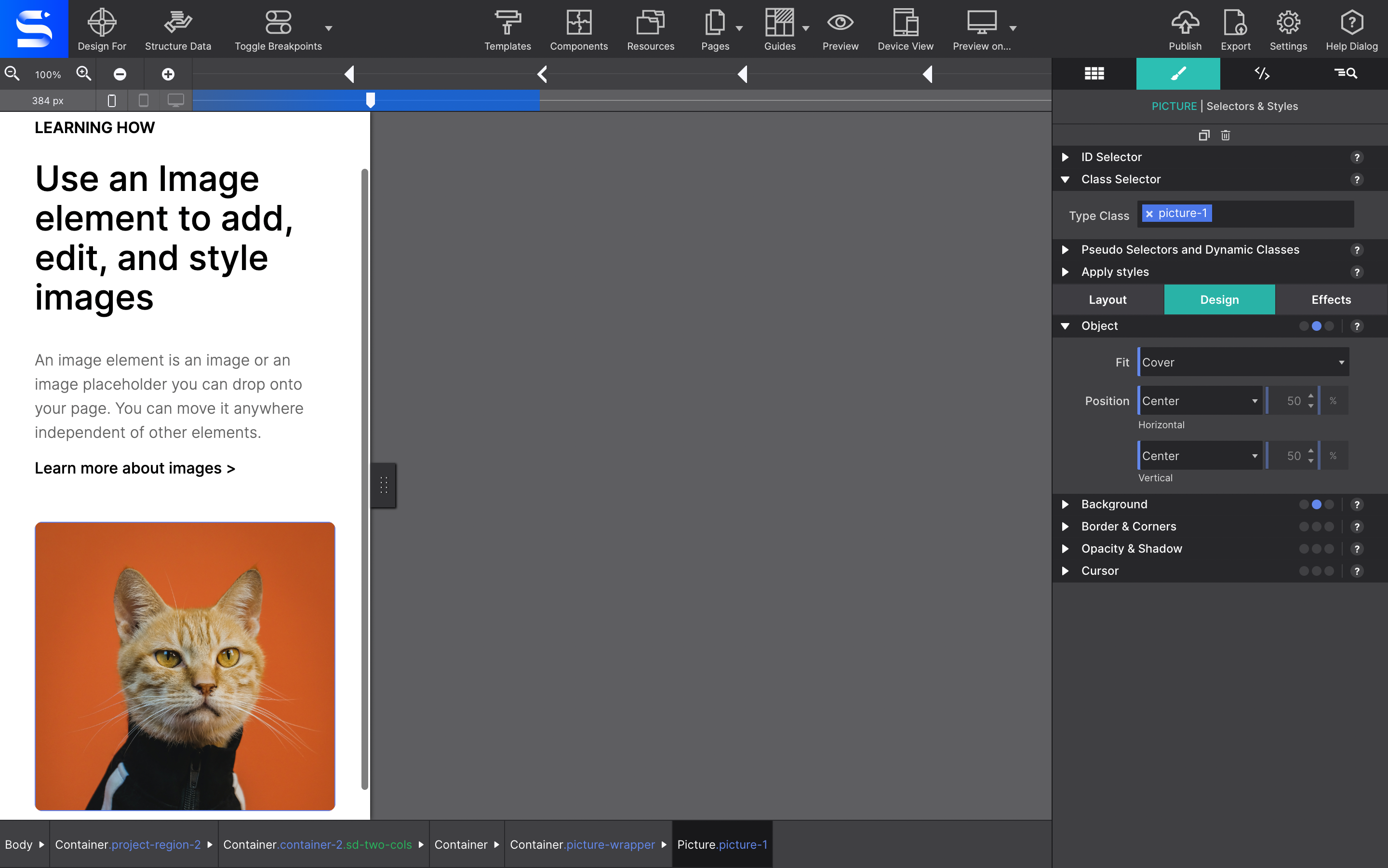
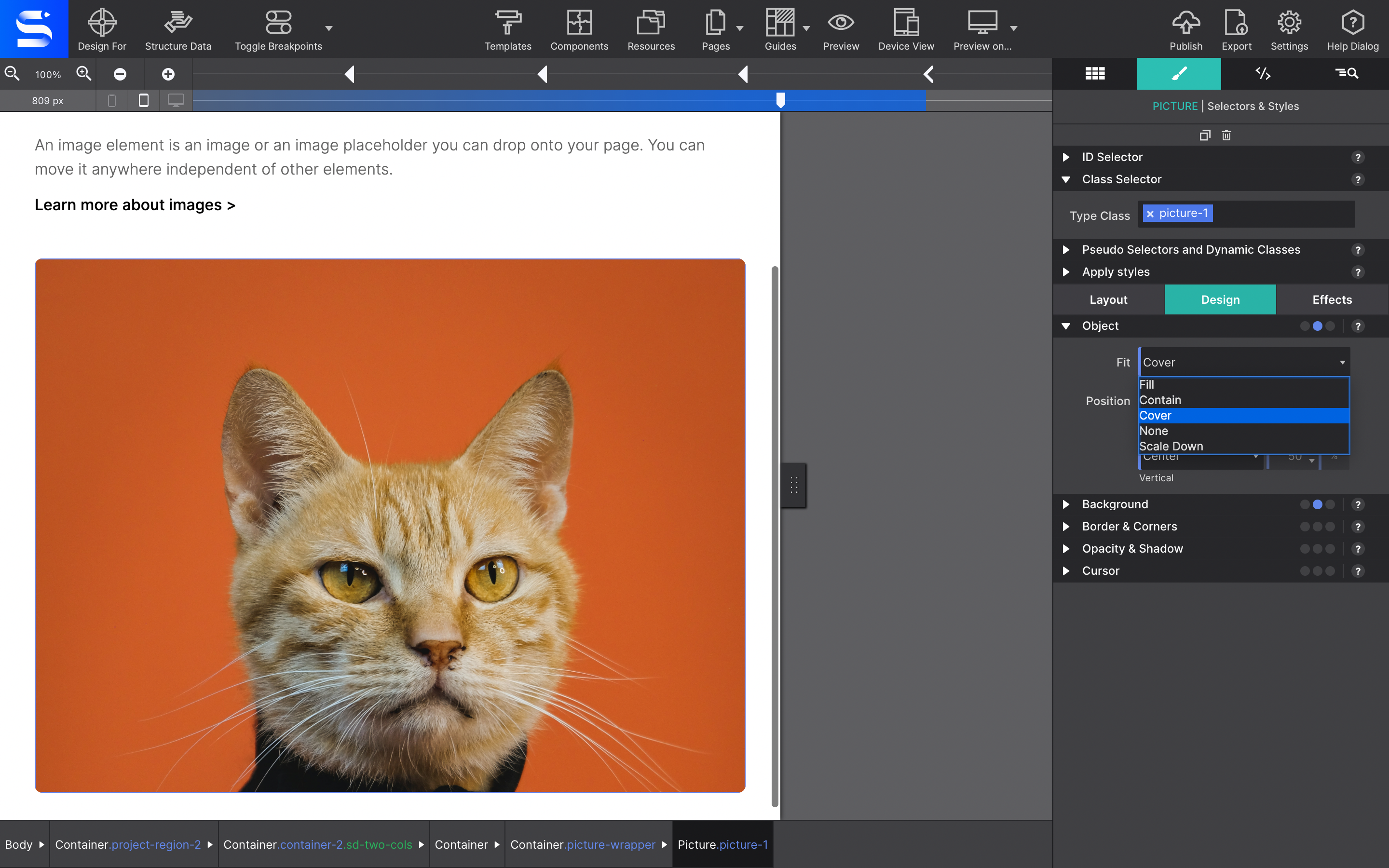
The Object controls in Styles pane → Design → Object let an image fill its container without distorting — no more hacks for stretched or cropped-off pictures.
| Value | What it does |
|---|---|
| Fill | Fills the container completely. If the ratios don’t match, the image stretches. |
| Contain | Fills the container while keeping the aspect ratio. Letterboxes if the ratios differ. |
| Cover | Keeps the aspect ratio and fills the whole container, clipping whatever doesn’t fit. |
| Scale Down | Shrinks the image inside the container. |
| None | Leaves the image at its own size. |
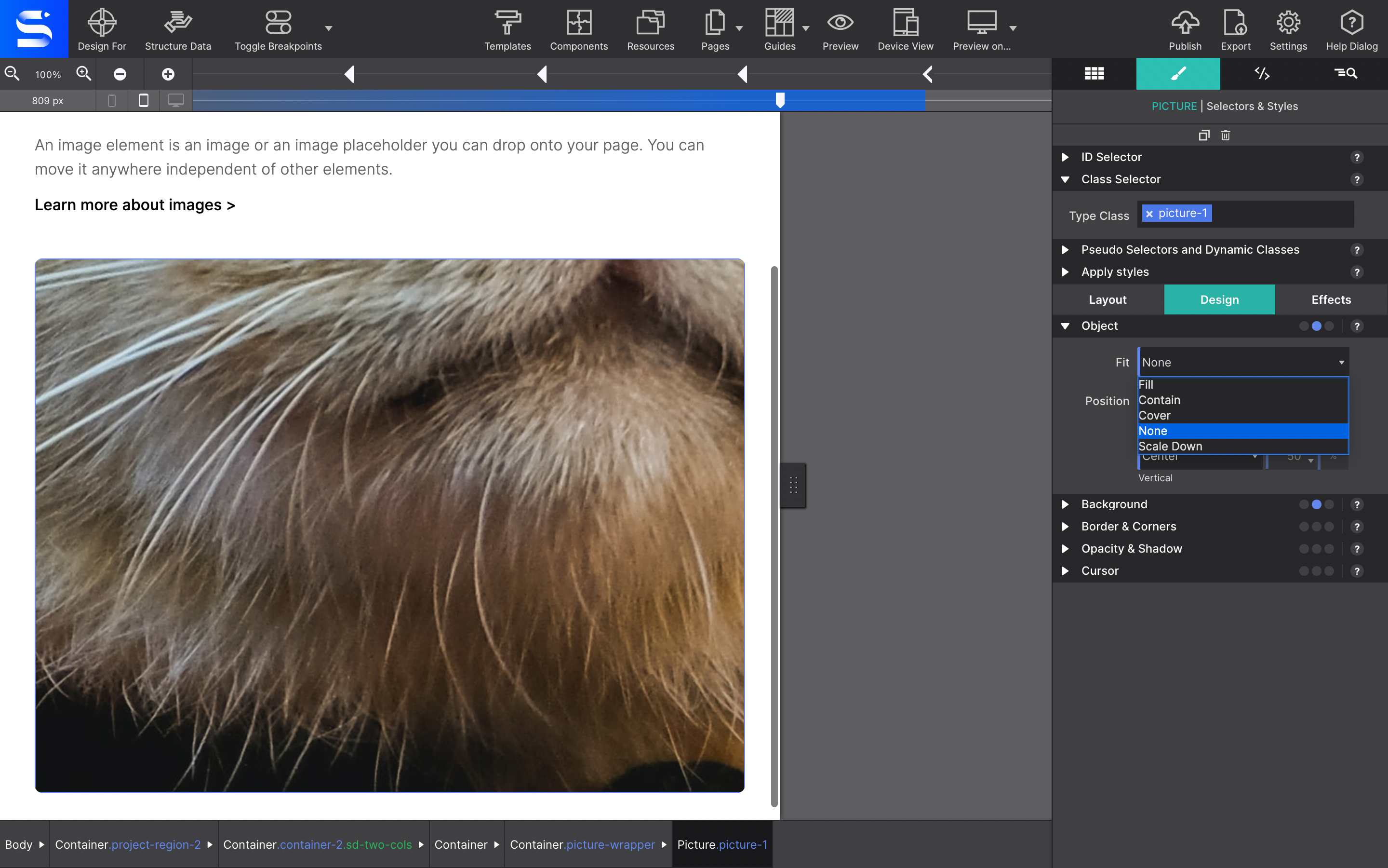
You may need to give the image a width and height, and set its position to absolute, for it to stretch inside its container.
Swapping the image at a breakpoint
This is where the real gain is. Drag the viewport slider and watch the image resize to fit; the device gauges at the top left hint at the kind of device that width corresponds to — a reference point, not a target, given how much device sizes overlap.
With the image in place, load smaller or differently cropped versions for narrower screens:
- Move the viewport slider to the breakpoint you want to change.
- Go to Element pane → Picture and use the dropdown to choose a different source file.
- Repeat for any other breakpoint that needs its own version.
A crop that focuses on the most important part of the picture often works better on a phone than the full scene shrunk down.
Picture element or background image?
This is the question that comes up most. If you want an image behind other content — headings, paragraphs, buttons sitting on top of it — do not use the Picture element. Set it as the background of a Container or of the Body instead, from Styles pane → Design → Background.
The Picture element is for images that are content in their own right. Background images are for backdrops.