Build a nested responsive menu
Browse tutorials- What you'll build
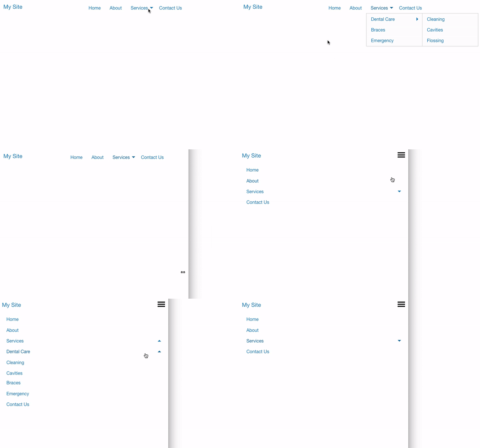
- A multi-level navigation that works as an accordion on mobile and becomes a dropdown menu on desktop.
- Time to complete
- 20–30 min estimated
- Prerequisites
-
- Your project must use the Foundation framework — the class names and attribute values are Foundation's.
- Familiarity with custom
data-*attributes helps, but the steps spell them out.
Navigation is the roadmap of a site. When you have more links than fit comfortably in a bar, nesting them keeps things organised — and a menu that behaves as an accordion on phones and a dropdown on desktop covers both ends.
1. The navigation bar
Start with the viewport slider to the left of the first breakpoint, so you’re designing mobile-first.
-
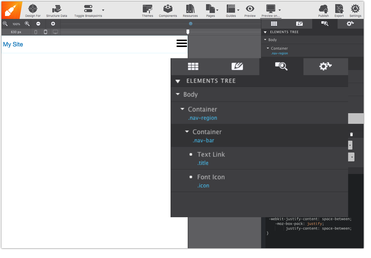
Two containers
Add a Container to the canvas — a Container Nav, for semantics — with the class
nav-region. Inside it add another Container with the classnav-bar. -
A link and an icon
Into
nav-bar, add a Text Link and a Font Icon Link (under the Font Icon dropdown). They stack at first. -
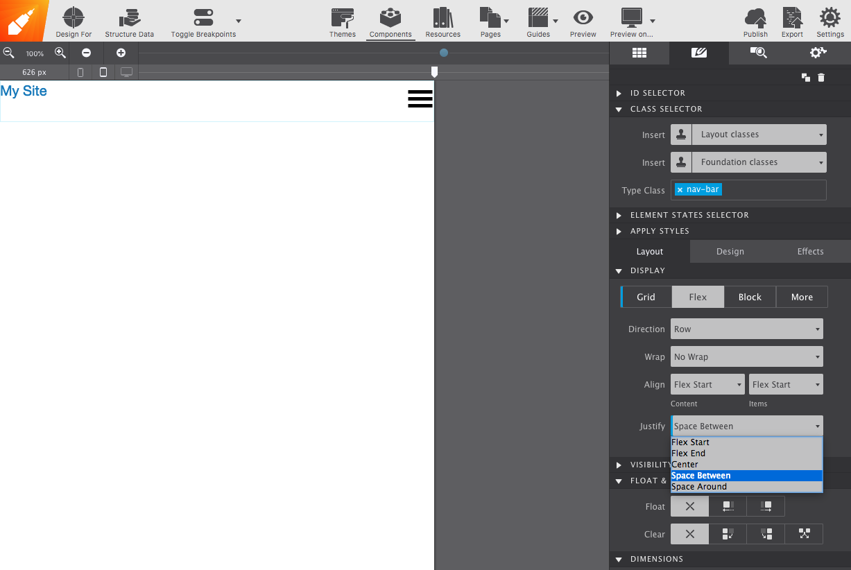
Lay them out with Flex
Select the container, go to Styles pane → Layout, set Display to Flex, and set Justify to Space Between so the two sit at opposite ends.
Your structure should now match this:
2. The links
-
A second container for the menu
Select
nav-regionand add a second Container from the Content pane, so its contents can be manipulated without affecting the bar. Give it the IDsub-nav— you’ll need it later — and the classsubnav-section. -
A list container
Add a List Container inside
sub-nav. This is the equivalent of a<ul>. Adjust how many list items it holds from the Element pane.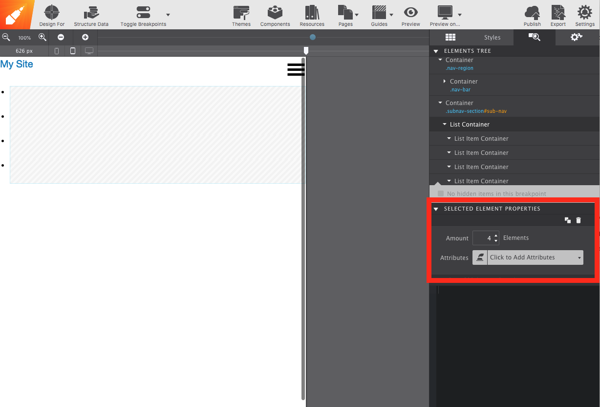
-
One link per item
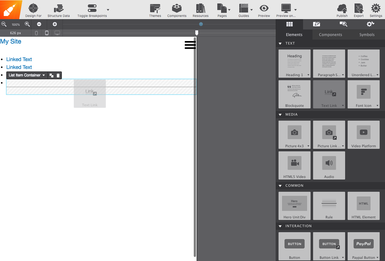
Drag a Text Link into each List Item Container and edit the text on the canvas — Home, About, Contact.
3. Classes and attributes
Attributes are the hooks that tie an element to a framework’s JavaScript. Site Designer exposes them in the Attributes section of the Element pane — see custom framework attributes.
-
Select the right element
Find the List Container. The reliable way is the Element pane: hover an element name there and it highlights in the live preview, so you can confirm you have the
<ul>selected.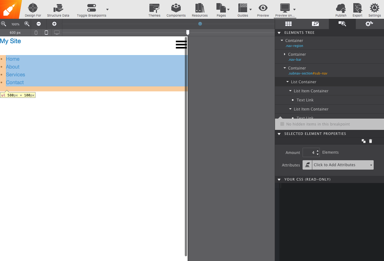
-
Three Foundation classes
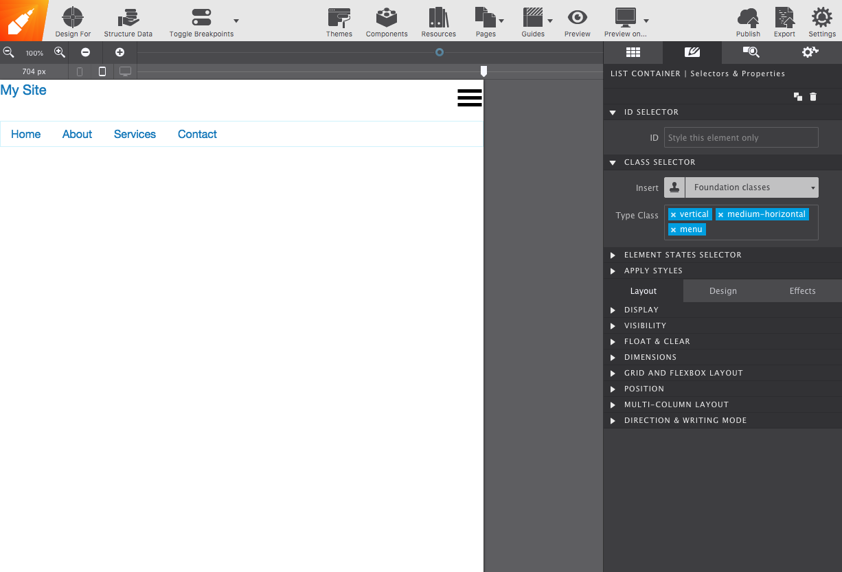
Double-click it to open the Styles pane and add the classes
vertical,medium-horizontalandmenu.verticalstacks the menu from the smallest screen up.medium-horizontalflips it to horizontal at the medium breakpoint.menuturns it into a flexible navigation component.Drag the slider right and watch it change.
-
Make it responsive
In Element pane → Attributes, add Data Responsive Menu with the value
accordion medium-dropdown. Accordion by default, dropdown from medium screens up.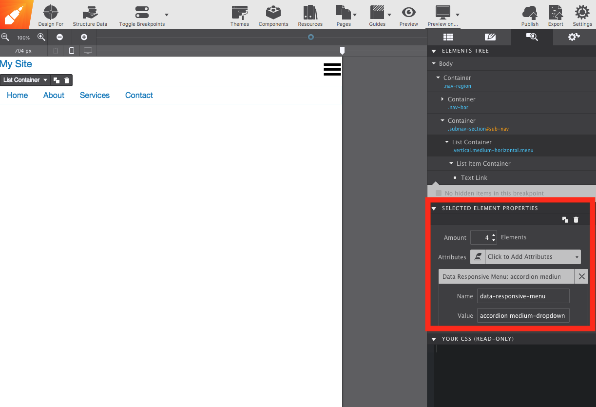
4. Wiring the hamburger
The icon has to trigger the menu, and the bar has to get out of the way on large screens.
- Select the
nav-barcontainer and add the Data Responsive Toggle attribute. - Select the menu icon and add the Data Toggle attribute.
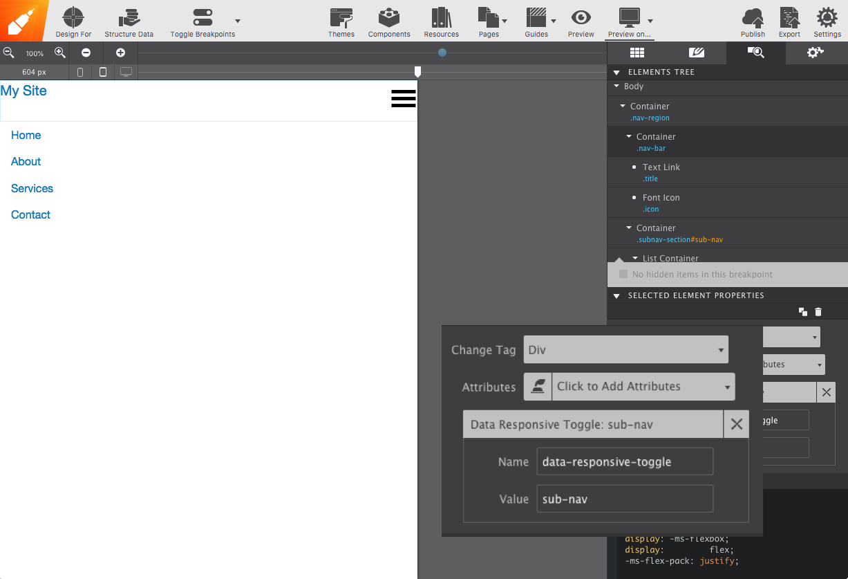
Preview in the browser with Preview On to see it work.
5. Nesting
To put sub-items under a link — say, under Services:
-
Nest a list inside a list item
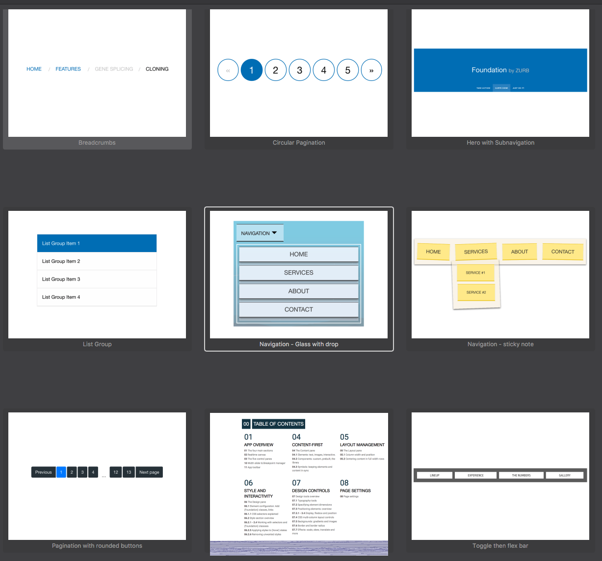
Select the link’s parent List Item Container and drop another List Container into it from the Content pane.
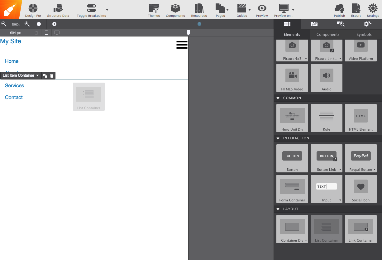
-
Fill and class it
Set how many items it needs from the Element pane, add a Text Link to each, and give the new List Container the
verticalandmenuclasses so it matches the rest.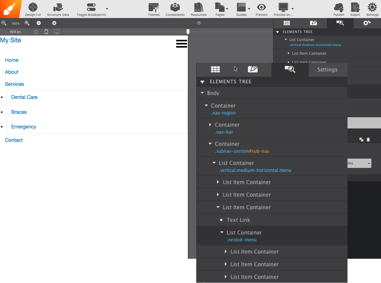
-
Go one level deeper
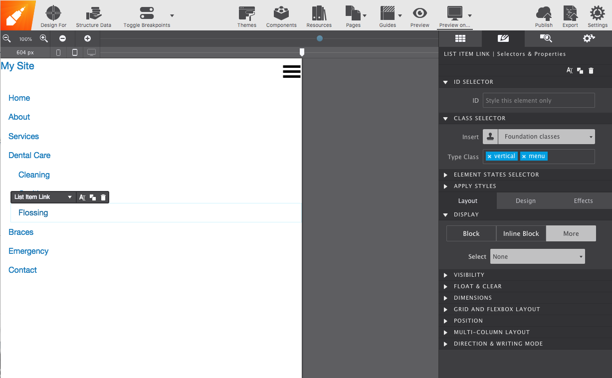
For a third level, drop a UL Link into the List Item Container — in the example, inside Dental Care. Each UL Link also gets
verticalandmenu.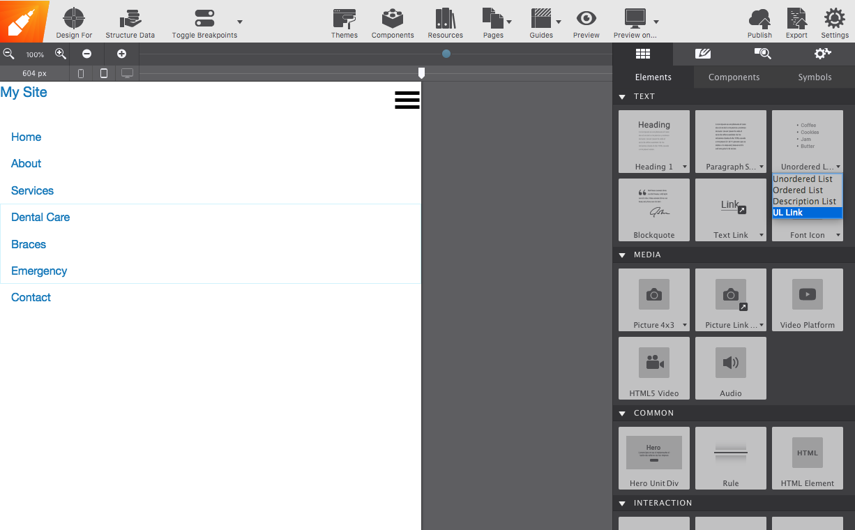
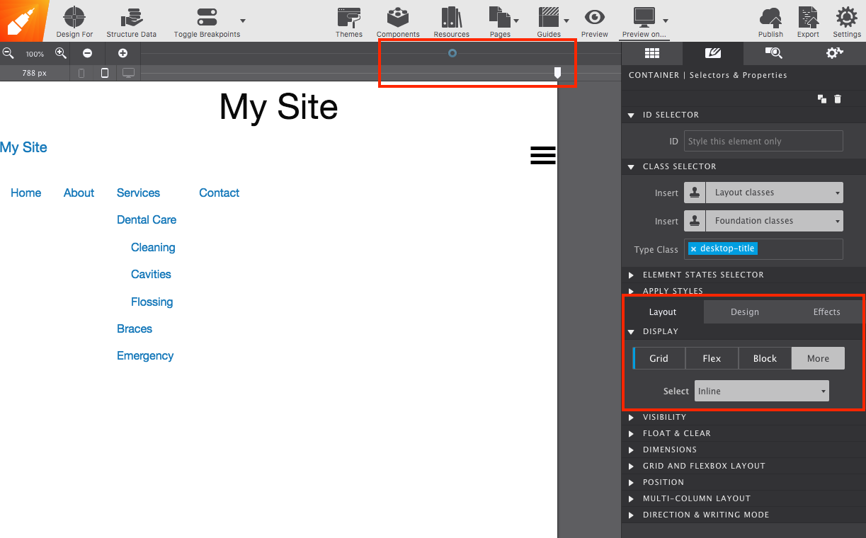
6. Keeping the site title on wide screens
Add a Container to nav-region with the class desktop-title, holding a Heading with your site name.
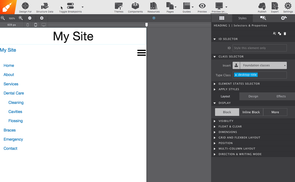
With the slider left of the lowest breakpoint, select desktop-title and set Styles pane → Layout → More → None to hide it on small screens.
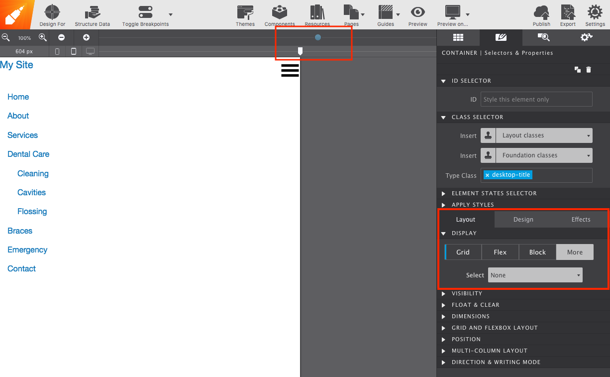
Then move the slider right of the next breakpoint and change it from None to Inline, so it appears on wide screens.