
CSS selectors explained
For those that have been working with CSS selectors before, the workflow will feel intuitive and powerful. It will still help to give this section a quick read and, for example, familiarize yourself with the color coding system for the different selector types.
If you never heard about or worked with selectors before, no worries. Our responsive apps can also automatically create selectors. However, to get the most out of our apps — to speed up the design workflow and make it easy to maintain any projects — we do recommend to slowly start accustoming yourself with the app’s selector system and predefined framework classes. This section will serve as your guide.
A selector defines — ‘selects’ — the elements to which a set of CSS rules applies. This is incredibly powerful because it makes it fast and easy to give multiple elements the same appearance. Or to apply the design rules to a newly added element without having to redefine all these rules.
If you are using one of the frameworks (Foundation, Bootstrap or Materialize), the Insert Framework classes can be used to search and add framework-specific classes for which the design rules have been pre-specified.
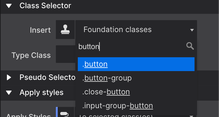
An example using the class selector
Let’s quickly go over an example using the class selector. For example, in Foundation a button is created by adding the class button to an element. The class (name) is the carrier of a set of styles such centered text, padding around the text and so on, that this way gets applied to the element.
Other styles can be added by extending the rules set for the same class, or by adding another class with new rules. Foundation uses the second approach — by defining all base button styles on the button class and applying additional rules through new classes, contextual variations are created.
In the example below all three button elements use the button class. By default, these buttons appear blue. Then the green button is created through the success class. The orange button uses warning.

The additional class names create the contextual background color. Now you can make changes to all buttons by working with the button class, to all success buttons using the success class and so.
If you prefer a different type of base button set in your project, for example buttons that are the same width and have rounded corners, simply define these styles (in the style section that we will look at in a bit) on the button class and all buttons will take on that appearance.

Please note that you can add one more class — like button-custom — to make these changes. If you do it to the button class itself it would also have affected any other button in the project.
With this explanation and example under our belt, we should be ready for some more selector goodness. We will do that when discussing the style section next.